

The London Tube map with distance grid lines. Click the image to enlarge.
I’ve always enjoyed discussing the way subway maps are designed. Schematic-based maps give away to geography which lead to the intersection of the two, and it seems as though there is no right answer in the quest to develop the most useful and visually appealing map.
The London Underground’s map enjoys its place amongst the iconography of world subway maps. Harry Beck’s map is one of the most instantly recognizable around, and it’s also one of the maps least tied to the surrounding geography. Stations in the London core are placed to fit on the map and not the corresponding street grid, and tourists who try to use the map to navigate become hopelessly lost.
One designer has tried to remedy the situation. It’s a map that’s been out there for a few years but recently made an appearance on Boing Boing, and it attempts to bring a sense of distance to the Underground map. It is, simply put, the London Tube Map with a Distance Grid. Take a look at this close-up:
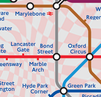
Here’s how the designer explains it: “The only real difference is that it has a fine grid that shows how far apart the stations are in real life. It also illustrates what the real directions between the stations are. In Zone 1 (pink), the squares have 250m sides, and in the other zones they have 500m sides. If there are exactly 3 squares between a pair of stations in Zone 3, then they are 1.5km apart. If a grid line runs between two stations, then one is due North (or possibly due East) of the other.”
I like the idea as a static map, but as an on-the-go pocket tool, it’s not so practical. The lines are a bit too hard to read, and it requires more thought that a map should. But it’s a subtle way to impose distance over a schematic map without distorting the features too badly.
7 comments
I don’t really thing knowing the distance between stations will help most people navigate any more effectively. And let’s face it, the people smart enough to figure out this map are probably smart enough to get by without it.
Somewhat off-topic: The description of the scale of the map instantly reminded me of one of my lost causes from the 1970’s: Conversion to the metric system, which is used worldwide. We are still using the English system, even though the English themselves are NOT using it.
It actually reminds me of a map laid on top of a mid-1960s op art image (and since this is a London rail map, let’s use this as an example)
I’m one of those people who think that the Beck map is hugely overrated, on basically two grounds. First people don’t travel the subway to go to subway stations, they go to actual neighborhoods and so the map has to show some relationship between the rail network and the geography of the city. Second, the bunching of stations tends to occur in just one small part of the city, usually the center. If you use the train to get between points outside the center, or to move between a place in the periphery and a place in the center, a geographic map will do because you don’t need to see every place in the center.
But as it happens, London has a geography where the distinction between the center and the periphery is not clear. New York is very different, where you can handle most of the problems caused by the bunching of stations and lines in Manhattan simply by making Manhattan bigger than it really is.
Its noteworthy that intercity rail maps (though not in New Jersey) tend more to show the actual geography.
My preference is for two maps, one of the central area where the lines are bunched up, and a geographically correct map of the whole city, where the lines and stations in the center are shown but not labelled. But I don’t think any system has tried this.
I’ve often wondered why the MTA doesn’t post Manhattan-only subway maps in cars (since 80% of riders/tourists who don’t know the system are traveling within Manhattan) and also post a geographically correct map with the other 3 boros that have subways somewhere else in the subway car, with a note saying “See Manhattan map for more details” or something to that affect. And as much as I love Staten Island, there’s no need to put it on subway maps since the SIR is not connected in any way to the rest of the system.
Both the Chicago L map and the entire transit map do just that. Show the system (close) to scale and then minimize the Loop, opting to use a blown up inset to show the detail. The attached pdf link shows both examples
http://www.transitchicago.com/.....ochure.pdf
The secret of the Beck map — the original one — is that he started with a geographic map of the system as-it-was-then and eliminated the parts which seemed irrelevant or distracting.
The *problem* with the Beck map is that subsequent changes (many, many of them) have resulted in tweaks to the *diagram*. What is needed is a complete reassessment of the map, starting with a new geographic map and performing the same abstraction. A city-specific and network-specific abstraction, not a blind mimicking of the Beck map.
You’d end up with a very different shape. In a modern map it would probably make sense to draw Crossrail and Thameslink (fast services) as straight lines, and figure out what to do with the rest of the map after that; I may try it some time.