On my way to the Jay St.-MetroTech ribbon-cutting yesterday, I hopped on a Manhattan-bound 3 train at Grand Army Plaza and found myself in a car surrounded by unfamiliar placards. Instead of the regular SubTalk signs discussing various goings-on at the MTA, I was face-to-face with this sign. Identical to the example atop this post, it said “Improving, Non-Stop” and was clearly a redesign of the MTA’s house ads.
When I arrived at Jay St., I had a chance to quiz Jay Walder and Paul Fleuranges, the MTA’s Senior Director of Corporate and Internal Communications, on the changes. The new signs have been designed to explain a mix of messages to riders with a focus on highlighting, as Walder said, “things we’ve done this year and improvements we’ve made.”
Graphically, the signs are meant to be simpler than the old SubTalk signs. The top is calmer, with more white space, while the MTA bullet, minimized on the old version, has been restored to a primary spot at the top. The website address is added subtly below the bullet. For the ribbon across the bottom, the new signs borrow the strip map stylings that are prominent on the cover of the new subway map.
Fleuranges and I spoke about what will be on the signs. Some of them — such as the one above which you can click to enlarge — feature general messages about the need to improve the system. Another thanks the MTA’s employees for their hard work. Others focus on bus lanes, the changes made to Select Bus Service and the arrival of the countdown clocks throughout the subway system. Fleuranges said that Transit is unveiling nine or ten new signs this weekend with more to come over the next couple of months.
The long-running SubTalk ads debuted in 1993 and were often in the news. For years, the rotating ads included a popular series called Poetry in Motion, but that was canceled and replaced with the Train of Thought ads in mid-2008. According to Fleuranges, SubTalk hasn’t been officially canceled; for now it’s “on haitus.” The Train of Thought ads though are “on the way out.”
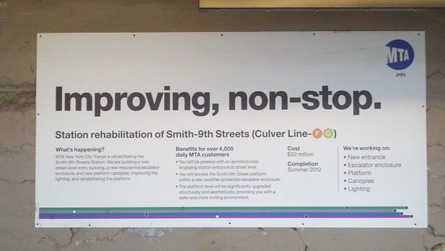
In addition to spots in subway cars, the “Improving Non-Stop” ads will pop up at construction sites as well. On the way back to Park Slope from Downtown Brooklyn, I spotted one at Smith-9th Sts. It looks a little something like this:

The Improving Non-Stop signs inform customers of big-ticket construction projects. (Photo by Benjamin Kabak. Click to enlarge)
The idea here is to present riders with the same look and same type of messaging as the in-car ads features. After nearly two decades, it was time for a rebranding.


13 comments
Speaking of signs, I took a ride today over to the new MetroTech station to see it for myself.
It lived up to all its billing, except for something I noticed on the former Lawrence St. platform. When you step down from the stairway onto the platform, there is NO sign indicating which side is for the Manhattan-bound trains and which side is for the Brooklyn-bound trains.
Your tax dollars at work!
With the “Improving, Non-Stop” tag line, I wonder how long it will be before the MTA gets it’s first complaint from someone who wants improvements on the local lines, too…
I wouldn’t say that a city is only as good as its transit system, unless I wanted to insult New York.
So i guess “Improving, non-stop” replaces the old Subtalk tagline, “Going your way”?
They can save a lot of money, free up space for revenue advertising and be more environmentally aware if they would use the video monitors on the R160s for these messages instead.
So no more poetry or quotes mixed in with the ads? That’s too bad. I’ve always enjoyed these.
Given the vast number of train cars, many of which carry clearly out-of-date advertising (e.g., for events that have already happened), the MTA can certainly afford to sprinkle some more profound thoughts in among the revenue-generating stuff.
I think those two were a victim of cost though. Barnes and Noble was a primary sponsor on the Train of Thought ads, and they’re going through some tough financial times these days as well.
I like these new ads. They prominently feature what the MTA is trying to do: improve the system that most love to hate. Should make for good PR and help improve it too (which I have always believed they needed to manage better). I actually saw a slightly different poster at my station:
“IMPROVING, NON-STOP. A system is only as good as its workers. Thank you [other stuff]”
Although I think the subtitles should’ve been more pronounced if they wanted their workers to notice…
[…] Snow stopped falling in the New York area nearly two days ago, and yet, the city’s transit network remains at less than full service. Buses are stranded; elevated subway routes are shuttered. Even as the commuter rail lines return to full service, New York City Transit is still trying to figure out what went wrong. After all, isn’t this the agency that’s supposed to be improving, non-stop? […]
[…] so in early December, as I reported then, the MTA rebranded its house ads. “Improving, non-stop” became the new tagline, and the posters featured innovations. […]
[…] the MTA unveiled their new signs in December, the rebranding effort was sure to be met with a certain public skepticism. It’s easy to say […]
[…] its new “Improving, Non-Stop” house ad campaign earlier this year, they did so, as I wrote at the time, with an eye toward Albany. The authority knew it had a an unfunded capital program with a $10-$13 […]