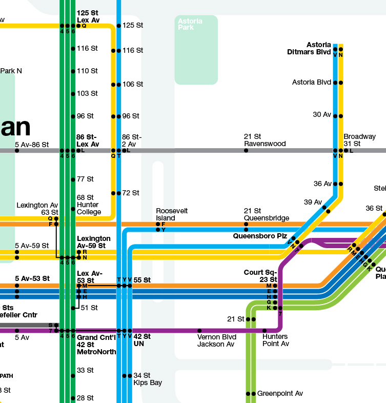
Archive for Subway Maps
Give the MTA’s new Weekender map a whirl
Posted by: | CommentsI’m away from my computer right now so I can’t give the MTA’s new online weekend map a ride, but you can. Check it out right here in all of it’s Vignelli glory. As you poke around with the map, I would love to hear your reactions. Leave a comment with your thoughts, criticisms and potential improvements, and we’ll soon find out just how useful this new offering is.
The return of Vignelli with a weekend twist
Posted by: | Comments
Transit's new Weekender offering provides an interactive, online solution to charting weekend service changes.
Over 30 years after being unceremoniously dumped in the face of extreme public outrage, the Massimo Vignelli subway map is making its triumphant return to the MTA this weekend. This map, repurposed to solve a problem that has vexed the authority for years, won’t be hanging in stations or cars, and in fact, it won’t be available in any physical form. Rather, the MTA will use it as a weekend landing page to offer straphangers a visual, interactive glimpse at the complicated array of service changes that often leave riders more confused than they should be.
The idea is a simple one. In fact, it’s a service Subway Weekender has been offering for years. By providing a visual representation of service changes instead of the jumbled syntax of the weekly postings, Transit can better prepare its customers for weekend headaches. The service, termed the Weekender, will launch later today at approximately 3 p.m. and will be the landing page for MTA.info until shortly before Monday’s morning rush. It is, according to Transit, very much a work in progress, and the MTA will look for rider feedback as it improves this much-needed offering.
Michael Grynbaum of The Times got the scoop on this project, and he offered up a wealth of details:
The stylish digital map will be customized each weekend to reflect the myriad service changes that regularly bedevil straphangers on Saturdays and Sundays. Currently, rerouted lines and shut stations are noted only in stiffly written prose that sometimes compound riders’ confusion. The interactive map is searchable by line, borough and station, and it flags trouble spots with blinking lights. Click, and the site will reveal a rundown of what woe awaits, whether a closed platform or an unexpected station stop. …
The Weekender does not redraw the usual map so much as annotate it. The A train, for instance, has an irritating habit of running along part of the F line on weekends. But the map, rather than repositioning the A’s blue trail onto the orange F route, simply flags the bypassed stations and offers a written explanation. (Officials said a more dynamic map would be logistically difficult to execute.)
Still, the online map has appealing features, including a line-by-line view, which highlights, in vibrant colors, the entire length of an individual subway route while fading out the others, like pulling a strand of spaghetti from a knotty pasta. Riders can quickly find out about changes on their own route while ignoring the rest. The site also allows users to toggle between the subway diagram and detailed neighborhood maps, which list local attractions.
“The idea here,” Margarte Coffey, a Transit official said to The Times, “was: ‘How do you show people at a glance what’s really happening?’ You’ve got this comprehensive poster that says all that is happening this weekend, but you still have to stand there with a map to be able to figure it out.”
Recently, the MTA’s growing weekend ridership has dominated headlines, and with it, weekend travel has come under the microscope. The City and State Comptrollers released a largely clueless report on weekend work that did manage to highlight the MTA’s information deficiencies, and this is a start. Plus, it returns Vignelli’s map, with updated colors, to the public eye. That’s bound to be good for some long arguments over design and functionality.
For now, the situation underground isn’t going to improve. Service changes will come and go as work continues, but the MTA is trying to make it easier for us to know how to get around during the weekend. And knowing is half the battle.
Map of the Day: London’s Tube with distance
Posted by: | CommentsI’ve always enjoyed discussing the way subway maps are designed. Schematic-based maps give away to geography which lead to the intersection of the two, and it seems as though there is no right answer in the quest to develop the most useful and visually appealing map.
The London Underground’s map enjoys its place amongst the iconography of world subway maps. Harry Beck’s map is one of the most instantly recognizable around, and it’s also one of the maps least tied to the surrounding geography. Stations in the London core are placed to fit on the map and not the corresponding street grid, and tourists who try to use the map to navigate become hopelessly lost.
One designer has tried to remedy the situation. It’s a map that’s been out there for a few years but recently made an appearance on Boing Boing, and it attempts to bring a sense of distance to the Underground map. It is, simply put, the London Tube Map with a Distance Grid. Take a look at this close-up:

Here’s how the designer explains it: “The only real difference is that it has a fine grid that shows how far apart the stations are in real life. It also illustrates what the real directions between the stations are. In Zone 1 (pink), the squares have 250m sides, and in the other zones they have 500m sides. If there are exactly 3 squares between a pair of stations in Zone 3, then they are 1.5km apart. If a grid line runs between two stations, then one is due North (or possibly due East) of the other.”
I like the idea as a static map, but as an on-the-go pocket tool, it’s not so practical. The lines are a bit too hard to read, and it requires more thought that a map should. But it’s a subtle way to impose distance over a schematic map without distorting the features too badly.
More info emerges on new platform strip maps
Posted by: | Comments
A southbound IRT strip map sits on a post at 59th Street. (Photo by Juliette Wallack)
A few weeks ago, I write a short post on new strip maps that had begun to appear in a few select East Side subway stations. At the time, the MTA said to me that this initiative was the start of a plan to “increase the availability of easy-to-read maps throughout the system.” Today, a pair of articles illuminates the effort.
Over at DNA Info, Jill Colvin explored these new maps and tracked down a bunch of them at 59th and 34th Sts. for a slideshow. According to her reporting, these maps are still a trial. “This is a pre-cursor to the pilot,” MTA spokesman Kevin Ortiz said to her.
The authority, which has yet to determine a final design or a price point for the maps, is testing two versions. Those along the IRT are shorter and wider while those along the BMT are longer and narrow. In part, those design choices are part of the pre-pilot, and in part, the design choices are dictated by the routes that share tracks. The 4 and 5 branch off only at the northern ends while the R’s route can be represented on a linear strip map.
Meanwhile, over at the City Room blog, The Times profiled the maps as well. Aaron Donovan of the MTA spoke with Sydney Ember about the map. He said Transit wants passengers to know where they are “at a glance…without having to closely scrutinize or study a more broader map.”
So far, at least, these maps are far more prominent than the few that remain behind plexiglass on random platforms throughout the city, and they are reminiscent of a long-lost feature of the subway map. They are, of course, most useful during the day as they show only peak-hour service. I haven’t seen them in person yet, but in photos, they appear visible and useful.
Improving the way we find the way
Posted by: | Comments
The MTA's latest wayfinding sign on the downtown platform at Union Square. Click to enlarge. (Photo courtesy of David Sims)
Everything old is new again. As the MTA looks to improve the way straphangers get around — an important aspect of the service the authority must provide to its customers — it has turned to something familiar to those who know their subway history.
At certain stops along the East Side IRT, Transit testing new strip maps that show riders where the subway go. The new signs, similar to the one atop this post sent to me by David Sims, a SAS reader and reporter for The Chief-Ledger, are evocative of the strip maps that used to adorn the subway map back in the 1980s. By showing riders where the train that will arrive on that track will next go, the authority helps those without an encyclopedic knowledge of the subway system find their ways around.
I asked the MTA about the new signs yesterday, and an agency spokesman had this to say:
The subway system has been around for more than 100 years, and we are constantly looking for ways to improve the way it works for our customers. Similar to our mid-2010 redesigned service change posters, we’re taking a fresh new approach to increase the availability of easy-to-read maps throughout the system. While every station already has a subway map, customers don’t always have time to locate the map or sort through all of the information it provides. We’re trying out a few ways of doing this as a pilot and we’ll decide how to move forward based on customer feedback.
The strip maps are the first part of the pilot program, and it’s hard to dispute their usefulness or visual appeal. They may be limited in that they represent peak-hour subway service only, but that’s when most people are riding. I’ll be curious to see what the next step of this pilot program resembles.
Meanwhile, as part of a more long-term effort to deliver customer service upgrades, Transit is toying with the idea of retrofitting older rolling stock with digital signs. Michael Grynbaum has the deets:
New York City Transit is looking for a way to bring some of its older subway cars into the digital age. The upgrade, if put into effect, would bring automated station announcements and digital route displays to more than 1,700 aging subway cars, including the entirety of the B, D, and Nos. 1, 3 and 7 lines.
Those amenities come standard on the system’s blue-hued modern trains. Currently, the most high-tech signage on a B train is a plastic roll sign operated via hand-crank. To subway officials, intent on improving the passenger experience, the change would bring clearer, real-time travel information to riders tired of screechy intercoms and static maps. But the end of live announcements could signal another step in the creeping dehumanization of a subway system already shedding station agents and, on some cars, train operators…
Neither a timeline nor an estimated cost for the upgrade was available on Thursday, mostly because the transit agency still needs to determine if the idea is feasible.
I don’t put much weight into the nostalgia of live announcements. While Grynbaum spoke to Harry Nugent about the more colorful conductors, I side with Andrew Albert. “I haven’t heard the robot make a mistake,” the chairman of the New York City Transit Riders Council said. “I have heard the human make a mistake.” (Of course, the robotic announcements can be loud and annoying, but we covered that complaint recently.)
If the MTA can find a cost-efficient way to upgrade rolling stock that won’t be due for replacement for the next 15 years, they should. After all, it’s all about improving the customer experience. I would have to believe, though, that it might be easier to upgrade the static route signs on the R142s and R143s to the dynamic FIND displays. Too many times do I board a 2 train with the map for a 5 train and a note saying that the route-finder isn’t in service.
Essentially, these upgrades are minor ones that can make a big difference in the way New Yorkers and visitors commute. It can take a lot of the guesswork out of finding the way around, and that focus on the customer has been sorely missing for the MTA for quite a while now.
What impact a subway map’s design
Posted by: | Comments
A new paper underscores how the design of a subway map can impact passengers' travel decisions.
New York City’s subway map has a tortured existence. As I’ve written many times over the past four and a half years, the map is not quite schematic and not quite geographically accurate, and thus, it serves only as a loose proxy for navigation throughout the city. According to a new study, that could lead to warped perceptions about New York.
In a paper entitled “Mind the map! The impact of transit maps on path choice in public transit,” NYU graduate professor Zhan Guo explores how cartographical distortions can impact people’s relationships with the city writ large. The Transportationist highlights the paper’s conclusion (and a working paper edition is available online). It reads, in part:
The case study on the London Underground confirms that a schematic transit map indeed affects passengers’ path choices. Moreover, the map effect is almost two times more influential than the actual travel time. In other words, underground passengers trust the tube map (two times) more than their own travel experience with the system. The map effect decreases when passengers become more familiar with the system but is still greater than the effect of the actual experience, even for passengers who use the underground 5 days or more per week.
The paper also shows that the codification of transfer connections is also important. Different codification can make a transfer look more or less convenient on a transit map than in reality, which will either decrease or increase the perceived transfer inconvenience for the corresponding stations. This paper observes both situations in the underground case study and quantifies this codification effect, in terms of the number of attracted or precluded transfers, for four major transfer stations: Baker St., Bank/Monument, Victoria, and Oxford Circus.
Of course, these results are only based on the London Underground, a unique case in many aspects. Few transit maps enjoy such public popularity as the tube map in London. Many transit maps include prominent geographical features, which dilute the map effect. Other systems have different past or present versions of their transit map, which precludes a lasting and stable map effect. Many metropolitan regions possess an easier-to-comprehend urban form than London, which could weaken the role of a transit map in the formation of a cognitive map. The subway map effect in New York City is probably different from that in London. Therefore, readers should be cautious about making generalizations.
In spite of the last sentence in the excerpt above. Guo ponders how maps can impact transit operations and planning. A map, he says, “might unintentionally shift more passengers to a congested segment in the network and thus form a bottleneck” and a modification of a map could “change passenger behavior and mitigate platform and train crowding.” It’s the ultimate in human behavioral manipulation underground.
Over at Greater Greater Washington, David Alpert explored how applying Guo’s findings could impact the DC map. The changes, he notes, are not necessarily positive ones. A redesigned DC map would better show various landmarks in relationship with each other — Union Station’s proximity to the Capitol is one example — but it doesn’t necessarily improve overall system use.
“This is less useful in many ways than the classic map,” Alpert writes. “Most riders travel to and from stations in the core, and tourists or other riders unfamiliar with the system are most likely of all to do so. This map gives little space to that area and leaves large amounts of empty space at the edges.”
In New York, our map suffers from this problem in certain hub areas. It’s tough to tell how far places in Midtown are from the subway, and transfers are often distorted. For instance, the current iteration of the subway map makes no mention of the fact that the Q and N stop at a different platform at Canal St. than the R train does, and the transfer from the Shuttle to the C at Franklin Ave. in Brooklyn in deceptively far.
Ultimately, as Guo writes, “individual passengers and transit agencies should ‘mind the map’ in order to make their best planning decisions.” It is yet another consideration to ponder as the subway map, always a popular topic of conversation and debate, is revised and reevaluated.
Building a better bus map
Posted by: | CommentsOver the past few years, I’ve often examined the debate surrounding the New York City subway map. The map is far from perfect, and functionality and form often fight it out with design and readability emerging as the losers. While recent redesigns have pared down the extraneous information, the subway map is an incomplete glimpse at the subway system as it runs during certain hours of the day. For all of that, the bus maps are even worse.
Most notably is a lack of a comprehensive bus map. There is no publicly available map that unites bus service in all five boroughs. Instead, the maps focus on individual boroughs with some interborough express bus service highlighted as well. Even still, they are borderline illegible. Take a look, for instance, at the inset of Downtown Brooklyn available on the latest version of the borough-based bus:

It’s no wonder New Yorkers often find the bus system so hard to untangle when the visual representations do nothing to help. It’s almost easier to say what’s right about this map than what’s wrong. The New York City grid is very easy to follow here. Otherwise, colors, lines, shapes, arrows and numbers all bleed together to create something often harder to unpack that even the world’s toughest maze.
These days, it seems as though the MTA has given up on the bus map. The notes on the back are as tough to follow as the schematic on the front, and those in the city who rely on the buses learn their routes through either trial and error or the the strip maps on the bus poles. Admittedly, it’s tough to represent the bus system graphically, but with no rhyme or reason to the map’s colors, the current iteration fails.
Enter Anthony Denaro. The third-generation New Yorker has redesigned the Brooklyn bus map to show how one might better illustrate the system. Noting that the current map “lacks visual and operational organization strategy” and “underplays transfers with subway stations,” he introduces a map simplified by hub. The hubs are centered around Williamsburg, Ridgewood, East New York, Downtown, Bay Ridge, and Coney Island, and buses are grouped by color. “Riders,” he writes, “can make an approximation that a line will travel towards their neighborhood and ‘localizes’ those routes to their neighborhoods.”
Here’s the same Downtown Brooklyn inset:
What this move loses in geographical accuracy it more than makes up for in terms of readability. Overall, it’s much easier to trace the path of a bus and get a general sense of where the route will take a potential rider. Furthermore, instead of a confusing mass of information on the back, Denaro’s map offers neighborhood insets too. Here’s Williamsburg with subway transfers shown:

Right now, it’s clearly a work in progress, but it highlights a problem often ignored. If people can’t understand the bus system, they’re apt simply to ignore it. By presenting a map that makes more sense — one that is organized and color-coded — the MTA could indirectly encourage potential riders to hop on the bus. After all, knowing where you’re going is half the battle.
Map of the Day: Subway service at night
Posted by: | Comments
An excerpt of the night subway map from Astoria Bike. Click the image for a full version.
One of the constant complaints concerning the MTA’s subway map is how it isn’t exactly a comprehensive glimpse at service. Rather that representing the subway system as it is at all times, the current subway map shows service as it is during peak hours. It doesn’t reflect mid-day service changes; it doesn’t reflect weekend routes; and it certainly doesn’t show overnight service.
These shortcomings have long been recognized by the authority. In fact, the new map explicitly warns straphangers of its limitations, but although it urges users to check its website for information on off-peak re-routing, nowhere does a map exist on the MTA’s site with that information. In the digital age, that is a resource that should be readily available to the public.
Now, though, the writer behind Astoria Bike has tried to cure that omission. He has produced a late-night subway map. He offers up the impetus behind the map and a tale of trying to get the MTA on board:
Unlike every other city in the world, the MTA has never made a map of night service. This is a pretty big omission. Want to know how to get home? The official MTA party line is, “Overhead directional signs on platforms show… late night service.” Well that’s not much help! Especially given the horrible up-to-20-minute Zombie Wait (cue dripping water and rats). And God forbid you have to transfer. Or make an honest mistake because you trusted the day map! I pity the poor person waiting for the R late at night to take them to Queens…
The other night I was at Court Street in Brooklyn and was overjoyed to see the N train pulling in. I guess it does so every night. But I didn’t know. Because it’s not on the map.
After that night I actually wrote the MTA and offered to make a map night for them. Not surprisingly, I sort of got the runaround. So I did my best with photoshop and what I could find on line. I know the MTA is kind of anal about things like this, but my intentions are pure and non-commercial. This is a public service. I did the best I could. And any errors are my own (do let me know if you find mistakes). I do not claim any rights to this map (nor should you). It’s the MTA’s, if they want it. But they had nothing to do with the production.
Those interested can find a PDF version of the map right here, and it’s a useful thing to have late at night. Outside of the cost, there’s really no good reason for the MTA to avoid producing its own overnight map. There are just too many system changes after midnight and enough riders to justify the guide.
Map of the Day: The 1950s as a whole cloth quilt
Posted by: | Comments
A 1950s-era subway map served as the inspiration for this whole cloth quilt. (Photo via flickr user the workroom)
I always love seeing what other people are doing with the New York City Subway Map. From dresses to sunglasses, various iterations of the map serve as inspiration for the both the commercial and the artistic.
Today’s map draws its inspiration from the 1950s, and it is that map on a whole cloth quilt. Amusingly enough, it comes from a workshop in Toronto, and the stitcher even made sure to get the color coding as accurate as possible. For more on the map, check out Make Something’s post about it. With the subway map, an iconic image of New York City, anything is possible.
Videos of the Day: The sounds of the subway map
Posted by: | Comments
Conductor (Interactive instrument in progress) from Alexander Chen on Vimeo.
Check out this video from Alexander Chen. He currently works at the Google Creative Lab and has producing interactive works since 2003. The piece above takes the Vingelli subway map and some HTML 5 and Javascript coding to create a musical work out of the subway map. Says Chen on his blog:
Tentatively titled Conductor, it recreates the New York subway system as a musical instrument. It’s currently built in HTML5 + Javascript. SVG was very useful, as I could create the design in Illustrator, then import the coordinates into Javascript.
These videos are still in-progress tests. I plan to import an actual subway schedule from the MTA’s subway API and have subway trains triggering the performance. After that, I hope to start on an iPad version that would function more as a user-driven instrument.
I decided to use Vignelli’s beautiful 1972 subway map as a starting point for the design. Which will be interesting because a few lines like the 8 and 9 no longer exist.
In another piece embedded below, Chen used moving trains along the lines of the map to create a different piece. These are still works in progress, and Chen says he’ll post updates at his site. Check it out. I love creative uses of the subway map imagery, and these are quite unique.


