

Lower Manhattan looks more than a little lonely.
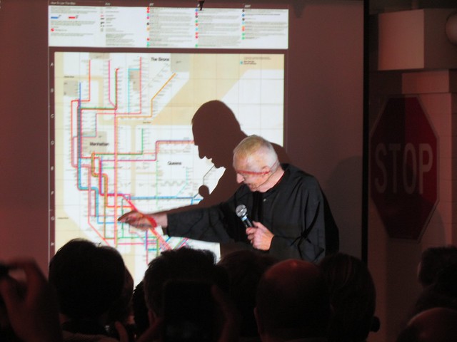
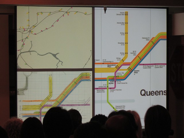
As subway service comes back online in pieces, it’s often difficult to put the convoluted service advisories into images. The MTA can describe the services offerings, but it’s far easier to understand them when presented visually. To that end, Transit has released a map of subway service for November 1. The visual is available here as a PDF and should be a very useful tool for those who are going to attempt to navigate the limited subway system tomorrow.


