

 Underground, Massimo Vignelli is the superstar of the design of subway signs. He is largely credited with bringing a uniform design to the subway system shortly after the formation of the MTA in the late 1960s. Vignelli, who at the time was with the design firm Unimark International, did not work alone. He brought Bob Noorda, a leader in Modernist design with him, and Noorda was one of the driving forces behind Transit’s eventual use of its now-ubiquitious and familiar signs.
A few weeks, Mr. Noorda passed away in Milan at the age of 82. His cause of death, one of his associates said, was complications from head trauma suffered after he fell recently. Over the weekend, Steven Heller of The Times penned an obituary that highlighted Mr. Noorda’s work in New York City.
As Heller tells the tale, Noorda, then based in Unimark’s Milan office, came to New York at the request of Vignelli in 1966 when the MTA commissioned the firm to help unify their signs. “I remember when Bob came to New York and spent every day underground in the subway to record the traffic flow in order to determine the points of decision where the signs should be placed,” Vignelli said.
Continues Heller:
The existing signs they encountered were cluttered with various typefaces of different sizes. “Their system was a mess,” Mr. Noorda was quoted as saying in “Unimark International: The Design of Business and the Business of Design” (Lars Müller), a recently published book by Jan Conradi. “Sometimes pieces of paper taped to the wall were the only indication for the station.”
He and Mr. Vignelli set about standardizing the type family to make sure that the signs were cleaner and clearer; they settled on Helvetica, originally a Swiss design known for its sans serif economy and sterility, against a white background. Mr. Noorda worked on every detail, from typeface selection to color coding. He “had a very systematic mind,” Mr. Vignelli said, adding that “his work was extremely civilized.”
Yet the project proved disappointing to the designers. The M.T.A. was responsible for executing the designs and producing the signs in its own sign shop, and Mr. Noorda’s directives were not always followed. The sign makers, for example, at first chose to use Standard Medium, a typeface from their own shop. “They did not want to invest in Helvetica,” Ms. Conradi wrote.
In the end, Noorda and Vignelli’s black-on-white designs were replaced by the MTA with white-on-black signage. The agency always maintained that the white-on-black designs were easy to clean and did not get as dirty as Noorda’s original creation. Although Noorda’s may have been easier to read in a dimly lit subway stop, the MTA’s edits proved more durable, and today, the Akzidenz Grotesk font on a black background, often with a thin white line running through the top, symbolizes the city’s subway system.
For many, the MTA’s signs have always just been there, but they are both a product of hard work and a remnant of Modernism that lives on in New York. It will be decades before someone comes along to overhaul New York’s subway signage, and today, as we remember Bob Noorda, his work lives on.
Sign illustrations courtesy of Noorda Design and the MTA. A hat tip on this sad news goes to my mom who sent me the obituary over the weekend.

 A month ago, the MTA had a legal obligation to pass a balanced budget, and in the face of a budget gap that may reach nearly $400 million, the agency simply passed a series of cuts that resembled those put forward in late 2008. Following that vote, MTA CEO and Chair Jay Walder directed those at the MTA to reassess the service cuts and set for the necessary savings in such a way that will have as little impact on the MTA’s customers as popular.
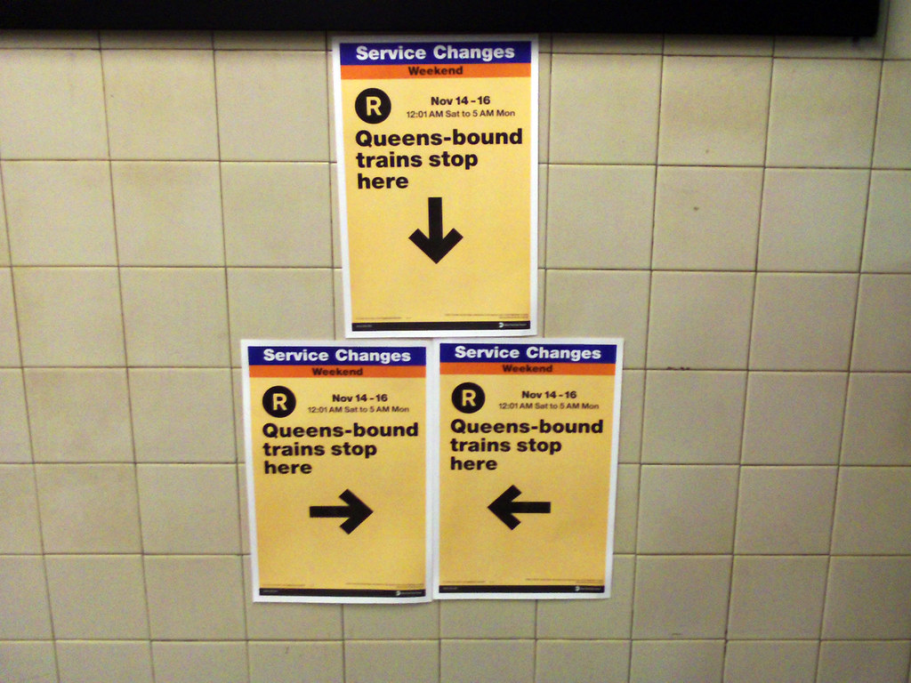

 In April 2003, the MTA ended a 50-year era. For five decades, New Yorkers had to load up their wallets and pockets with tokens if they planned to spend a day out on the town, but on a mid-April day seven years ago, the agency ceded ground to the MetroCard and ceased token sales. It was a death nearly a decade in the making and seemed to represent the death knell for something straphangers had come to love and hate.