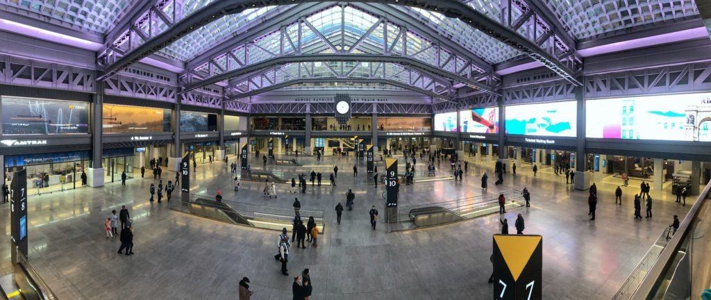
A panorama of Moynihan Train Hall, New York State’s attempt at righting the wrongs at Penn Station. (Photo by Benjamin Kabak)
New York spent $1.6 billion on the Moynihan Train Hall, but all we got was a big waiting room/mall with nowhere to sit. New York spent $4 billion on Santiago Calatrava’s Oculus, but all we got was a big waiting room/mall with nowhere to sit. New York spent $1.4 billion on the Fulton St. Transit Center, but all we got was a big waiting room/mall with nowhere to sit.
Are you sensing a trend yet? Why is New York spending so much money on giant waiting room/malls that all have nowhere to sit? And what does this say about how we’ve chosen to treat our public spaces and transit infrastructure? Must we make every public space so inhospitable to the people using it or can we find a better way? I’ve thought a lot about these questions since visiting the brand-new Moynihan Train Hall on Saturday, and while we have a chance, as a city, to design friendlier public spaces, the opportunity is slipping away.
Before I dig into this philosophical discussion on urban policy, let’s talk about Moynihan Hall. It’s very nice – exceedingly nice. It’s so nice that I overheard someone say to his companion, “This place is too nice.” I couldn’t tell if it was a compliment or if he felt truly out of place to be in a clean, light, airy, modern train station in the middle of Manhattan. New Yorkers are so beaten down by the grunginess of Penn Station and the general mediocrity of the design of newer transit infrastructure that something nice is too good to be true. This isn’t New York City; it’s too nice.
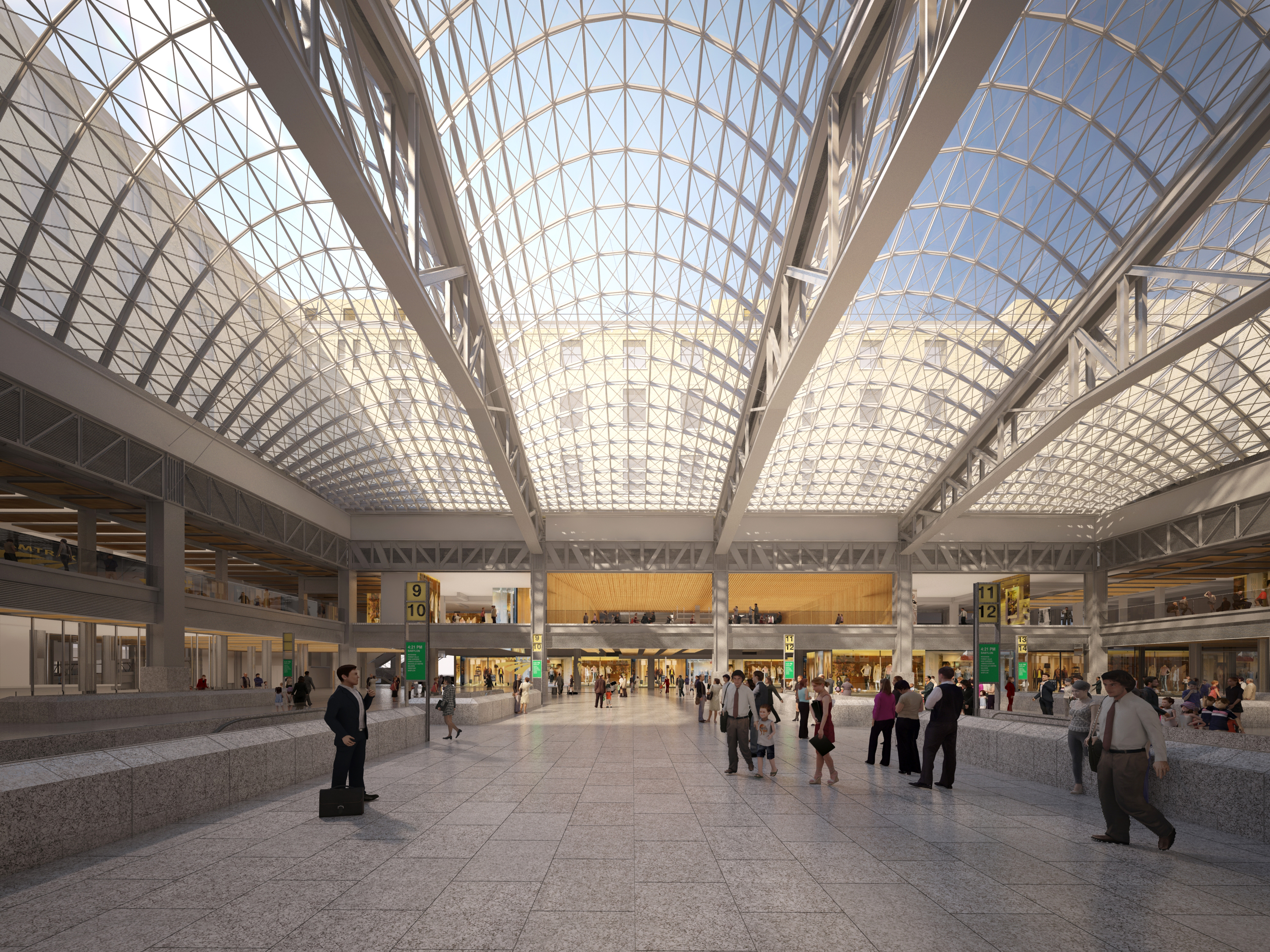
Moynihan Hall also isn’t finished. None of the shops or restaurants that will make it feel more like London’s St Pancras Station are open yet, and they won’t be until later in 2021. Even though Gov. Andrew Cuomo insisted on opening Moynihan Hall “on time” — whatever that means during the middle of a pandemic when few people are traveling — the building is still a work in progress. Still, it has high ceilings and clear sight lines and bathrooms with three faucets and feels very much a modern train station should feel. Moynihan Train Hall, a glorified and expensive waiting room, plays the role of a state-of-the-art train station quite well, and considering how much of the problems with Penn Station are aesthetic, that may not ultimately be a bad thing.
Without capacity upgrades or service improvements, I still can’t shake the feeling it’s the infrastructure equivalent of putting lipstick on a pig. Ultimately, the space looks like the renderings, and after decades of a cramped, crowded Penn Station, the new Hall is a significant visual and environmental upgrade. It makes going to Manhattan to catch an Amtrak or Long Island Rail Road train a pleasant experience.
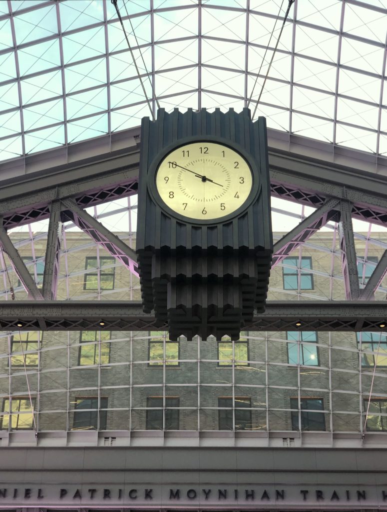
An Art Deco clock looms over the middle of the train hall. (Photo by Benjamin Kabak)
The critics have had a lot to say. You can read a review of SOM’s work at Dezeen and an interview with Peter Pennoyer, design of the Hall’s snazzy Art Deco clock, at Architectural Digest. (I love the clock, even if it is very much A Clock A Train Station Should Have According To Andrew Cuomo.) Justin Davidson likes it and took exception to my characterization of lipstick on a pig while Aaron Gordon found it mediocre. Steve Cuozzo thinks it’s a great example of adoptive reuse but says it can’t hold a candle to the original Penn Station.
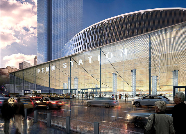
As nice as the new hall is, it isn’t all days of wine and roses. What Penn Station enjoys in location, location, location, the Moynihan Train Hall does not. Penn, situated between 7th and 8th Avenues and one block away from Herald Square, is amidst 14 different subway lines. The entrance to Moynihan is west of every single one of the subway lines, and the Hall itself, with escalators down to the Penn Station platforms, is even further west. It pretends to be a Penn Station replacement but without Penn’s greatest asset, and when the world returns to regular commuting, those heading into the city may find the convenience of Penn and the shorter walk to the subway outweighs a nicer glimpse passing through Moynihan.
The hall itself continues the siloed fiefdoms of Penn Station. Although the new hall provides access to Long Island Rail Road and Amtrak trains, you wouldn’t even know New Jersey Transit services Penn Station. There are simply no signs of the New Jersey-bound trains. That’s partially due to the reality that you can’t access every NJ Transit track that far west, but it’s also due to the fact that none of the three entities that use Penn Station get along. Without through-running or capacity increases that won’t arrive until we get new trans-Hudson tunnels and Penn Station South, the Moynihan Train Hall is a testament to the reality that it’s harder to rationalize operations across multiple transit agencies based in different states than it is to simply renovate an old building that was already there.
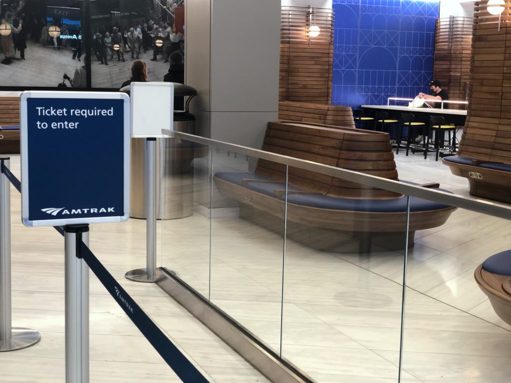
The only seats in the Moynihan Train Hall are reserved for ticketed passengers only. (Photo by Benjamin Kabak)
But beyond the politics of improving commuter rail service through the New York City area, a few key aspects of the Moynihan Train Hall speak to decisions we as a city have made regarding our approach to public spaces that do not sit right with me and reflect societal failures to address policy challenges. In a sense, the Moynihan Train Hall is a public space but hostile architecture. It’s designed to look nice, but it’s not designed to encourage reflection or time spent within the space. You are to pass through the space, admire the Instagram-worthy elements of it and leave. Soon you’ll be able to dine and shop as well, but when you’re done with that, get outta here.
To hit you over the head with this element, the new building is closed every night from 1 a.m. to 5 a.m., while Penn Station remains open, and there is nowhere to sit. The new hall is a vast open space with narrow escalators leading down to the platforms, clear sight lines, a stunning skylight and no seats. The only waiting areas are reserved for ticketed Amtrak and LIRR passengers, and while station architects say the dining hall will have seats when it opens in the fall, those will be for people who are eating. Moynihan is, like Calatrava’s Oculus, the Fulton St. Transit Center, and the current iteration of Grand Central, a train station with nowhere to sit.
Why, you may ask do we make public places so anti-public? The answer is rooted in our inability to house the homeless and our societal fear that New York’s homeless residents will take over public spaces that aren’t designed properly. If Moynihan were open 24/7 as Penn Station is, if Moynihan had seats out in the open, if Moynihan were truly a public space, homeless New Yorkers would not leave, as many do not leave Penn Station, the Port Authority Bus Terminal or even parts of Laguardia Airport. Instead of solving for this specific problem, whether through better housing programs or homeless outreach or humane enforcement of public space, the city and state have opted to turn public spaces into museums. You can look at them, but you can’t stay long because staying long isn’t comfortable.
This is, of course, a New York City problem that isn’t constrained to train stations, though the profusion of new train stations in recent years has laid bare this approach to public space. It manifests itself in the lack of public seating throughout the city and the lack of any public restrooms as well. If these spaces don’t exist, then “undesirables” can’t use them or inhabit them.
Now, this should not be read as a defense of ceding public space to anyone or turning those spaces into de facto housing at the expense of the general public at large. But a competent and functional government should be able to design nice new train halls that include spaces where the public can relax while enjoying these spaces and policies that address the root of homelessness. We have chosen not to, and as nice as Moynihan Train Hall is — as much of an improvement over Penn Station it is — it’s hard to look beyond the choice made to design the space. These design choices affect more than just the homeless. For anyone facing mobility challenges or anyone pushing luggage or rolling a stroller, Moynihan offers little respite from the constant on-the-go motion of people passing through. It’s a new train hall, where people come and go, without any place for anyone to simply sit and collect themselves for a few minutes, and that’s a design choice we should un-make in the future.


