The most useful poster nowhere to be found. (Courtesy of Vignelli Associates. Click to enlarge.)
In 1966, the newly formed Metropolitan Transportation Authority was busy planning for its subway system takeover, still two years away. Within the five boroughs, the Metropolitan Commuter Transportation Authority, as it was originally called, faced the challenge of rebranding a subway system that was, in parts, over six decades old.
At the time, the subways were a mishmash of signs and fonts. It was a graphics design nightmare. Signage left over from when the subways were run by competing corporations — the Interborough Rapid Transit company and the Brooklyn-Manhattan Transit Company — and the city’s own Independent Subway System dominated the tunnels and clashed with each other. There was no consistency to it, no unique identity.
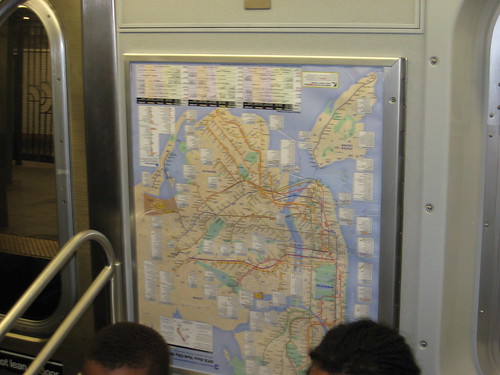
To remedy this problem, the MTA turned to Massimo Vignelli, one of the foremost Modernist designers of the era. While Vignelli would come to fame and infamy in New York due to his artistic but confusing subway map, the system still relies on signage and graphics he designed over four decades ago.
Taking a modular approach to subway signs, Vignelli used a clear Sans Serif font — Akzidenz-Grotesk, a cousin of the popular Helevtica — and designed the familiar paneled signs that could be manipulated to present everything from line route information to station identification. While Vignelli’s original designs were white with black lettering, vandals armed with spray paint quickly defaced these signs, and the MTA adopted the familiar white-on-black signs we know today.
As I was poking around the Vignelli Associates Web site recently, I came upon a partial representation of one of Vignelli’s signs that you see above. I did a double-take when I saw it simply because it is exactly what the New York City subway system is missing.
Allow me to present a familiar scene. A large family, clearly not from New York, is huddled near the token booth trying to make heads or tails of the subway map. They’re at Grand St. in Chinatown; they need to get to the Upper West Side to visit their daughter at Columbia; and it’s Saturday. They can’t tell which trains are running where, what to transfer to or how to go.
Enter this long-lost Vignelli sign posted above. Adaptable to individual stations, this sign explicitly lays out how to get from that point of entry to any other major station in the system. Using two columns — one labeled “Destination,” the other “How to get there” — this sign is a textbook example of an easy and direct way to present complicated information. Suddenly, the tourists don’t need to decipher a map; they can read a sentence instructing them to take an uptown D to 59th St./Columbus Circle, where they can switch to a 1 train making local stops through the Upper West Side. Easy as pie.
Why the MTA (or, in this case, New York City Transit) doesn’t employ signs such as these in popular stations is a question I will have to research. It wouldn’t be too hard to stick these types of signs up in tourist hot spots with directions to other major New York City destinations, and, in fact, it’s easy to group stations served by the same line in nearby neighborhoods as well.
It’s a testament to Vignelli’s abilities that his designs have withstood four decades of time. They still look good in the subways today, and his designs are evocative of the New York subway system. Perhaps then we should bring back one of his earlier ideas; it’s much easier to read a sign telling riders “how to get there” then it is to decode the subway map.


