
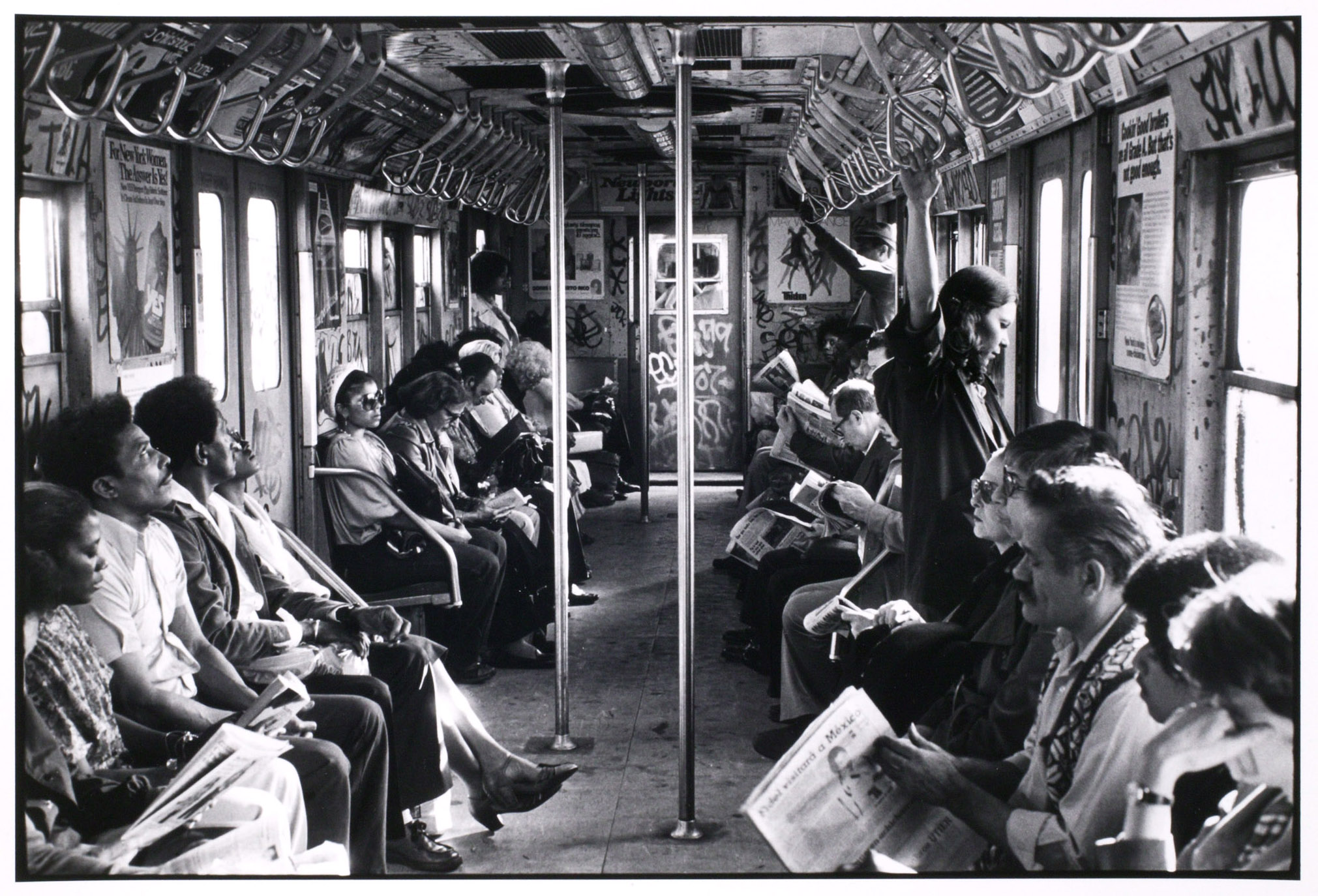
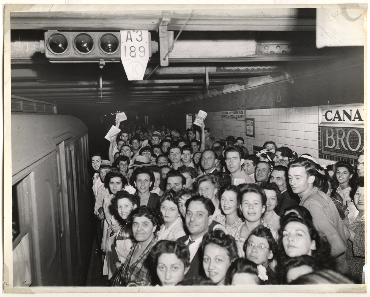
 Baseball fans who go to enough games grow family with the old concessionaire’s adage. You can’t tell the players without a scorecard, the saying goes. Similarly, a subway rider generally can’t navigate the the subway system without a map. Someone going from Point A to Point B needs to know the best way to get there, but how?
Yesterday afternoon, in a discussion on the recent history of New York City’s subway, a discussion broke out on the best way to present a subway system. Should the map be purely schematic and assume that people know the above-ground geometry? Should the map integrate the subway system on a near-accurate geographical representation of the city it services? As New Yorkers used to the geographically integrated subway system, we view those schematic maps suspiciously.
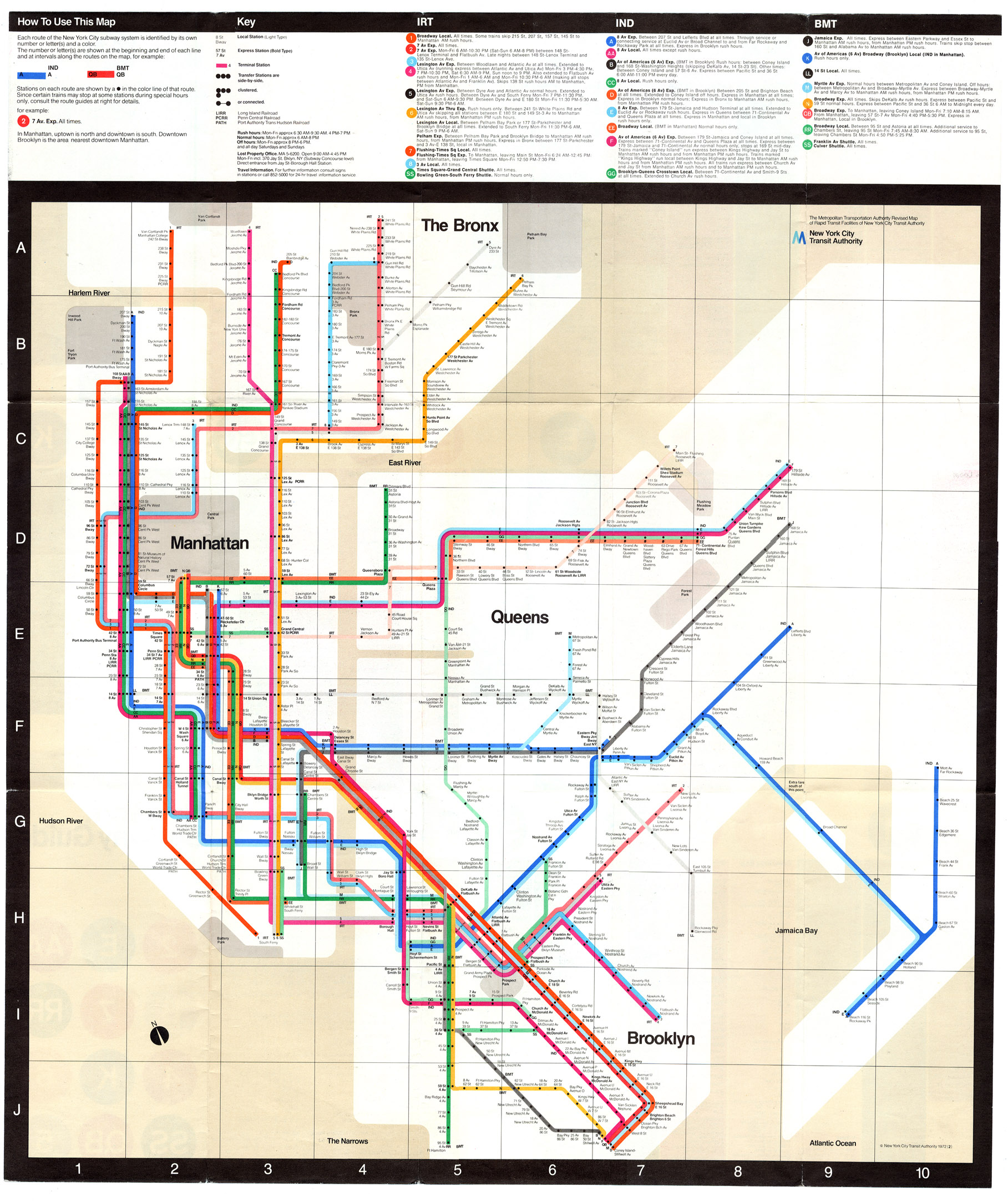
Up above is a thumbnail of our familiar New York City map. Click it to enlarge. As it stands right now, this map has a lot of information on it, and most of it is unnecessary. Boxes about bus connections — with no further information — ring the map, and lines emerge from major subway stops. Staten Island has been moved to abut Manhattan and Brooklyn, and the box in the lower right corner attempts to explain which trains run when. Rush hour, weekdays, evenings, weekends, late nights: read the key and then find your line. It’s almost a game.
Meanwhile, this map also incorporates almost the geography of New York City. Some major through streets are marked, and some — but not all — parks show up on it. As The Local noted a few months ago, Fort Greene Park is nowhere to be found, but the smaller Washington Square Park is front and center near the W 4th St. stop. For those not familiar with New York City, our subway map simply doesn’t help above ground even as it tries to. It makes distances look shorter than they are and omits some landmarks while including others. It’s an approximation of the city at best.
 Moving out of the city, we arrive in London to find an entirely different concept of the subway map. The current Tube map, an evolution of a design by Harry Beck, is a diagrammatic map of the Underground. It bears little resemblance to the actual geography of the city and instead presents the system as a series of zones with subway lines running in straight lines or at 45-degree angles. Sparse and simple, it has become a widely recognized symbol of London.
This map helps those who know where they’re going and few others. It gives no indication about distances between stations or about what might be around each station. It’s sometimes better to get off at an early station to reach a destination with a name similar to the next stop, but only those in the know would actually know that. It might look good; it might lend itself to easy imitation; and it might make navigating the subway system itself simple. But it provides no integration into the city.
Since Beck’s design arrived in London, derivatives have become the norm. Take, for example, a look at D.C.’s Metro map or Paris’ schematic. Angles, zones and sparse geographical markers rule the day while New York stands alone as a beacon of graphics design slowly, evolutionarily gone wrong.
So what’s the best map? Maybe New York’s old map — the one that used to show just the subways with a nod toward geography but an understanding that it wasn’t perfect — was the way to go. Vignelli’s map almost fits the bill, but navigating the subway system with it can be a Herculean task. Maybe we’re still just waiting for the right subway map, one that incorporates geography and complicated and convoluted subway systems into an easy-to-use map. Consider it the Holy Grail of subway mapmaking.

 Most New Yorkers wouldn’t recognize Kirsten Gillibrand, the state’s junior senator, if they ran into her on the street. An upstate politician who replaced Hillary Clinton one year ago, Gillibrand is suffering from
  As part of his ongoing series of progress reports into the MTA’s attempts at beefing up its security, New York State Comptroller Thomas DiNapoli has released his most scathing indictment of the transit agency so far. A new report, released yesterday, says that the MTA is years behind implementing its planned post-9/11 security upgrades and may very well run out of money before completing the project.