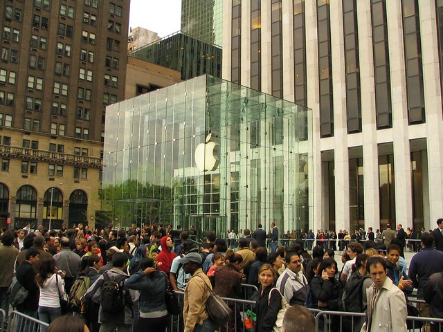
After much pestering by reporters and silence from Apple, the MTA finally released the official presentation to its board concerning the upcoming Grand Central Terminal Apple Store. The presentation — available here as a PDF — contains three high-res renderings of the proposed store, and as the above shot shows, it appears as though Apple and the MTA have figured out how to incorporate the store into the iconic and landmarked terminal without overwhelming it.

This rendering shows how the Apple Store will take over the currently unoccupied northeast balcony as well as the former Metrazur space. It appears as though the elevators from the lower level will open directly into the store itself, and I have to believe that security measures will be in place there as well. The total amount of space Apple is taking out comes to 23,000 square feet which includes the entire east and northeast balcony spaces. Apple is currently working on building out the store, and it should be open before the end of the year.
As I look at these renderings, one thought comes to mind: As integrated as the store will be with the Grand Central space, the images have very few people in them. The Apple Store, simply put, will be far more crowded than these illustrations show. As long as the computer giant and the MTA are prepared for the influx of people, this will be a very, very successful retail space indeed.


