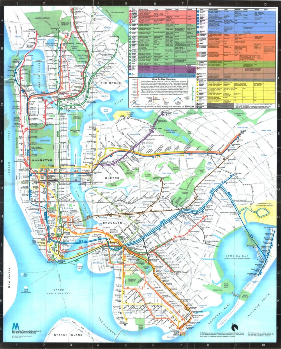
Michael Hertz’s 1979 original. Click to enlarge.
Michael Hertz, one of the lead designers of the current subway map, passed away last month at the age of 87. The Brooklyn native passed away in East Meadow, Long Island, and his map will long survive him. He unified the subway routes, giving single colors to each trunk line, and helped move the city beyond the controversial Vignelli Era. The Times published a touching obituary last week, and I wanted to wax nostalgic about my interactions with Hertz nearly a decade ago.
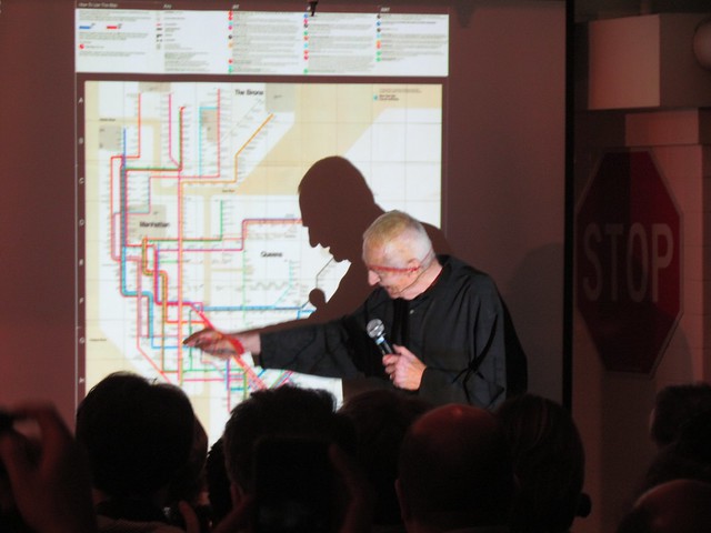
In late 2010, the Museum of the City of New York hosted a panel on subway map design. At the time, Massimo Vignelli’s diagrammatic map was enjoying a period of rediscovery and appreciation. It had been 30 years since the MTA had moved on from the controversial map, but map experts and designers praised its clarity and simplicity. The panel included Massimo Vignelli, John Tauaranc, Eddie Jabbour and historian Paul Shaw, and I wrote it up for a post. A funny thing happened after that post.
Tauranac, you see, was one of the designers of the 1979 map, but he wasn’t the lead designer. That honor went to Michael Hertz, the named partner behind the design firm the MTA tasked with updating the subway map. A few days after that panel, I received an email from Hertz. He and Tauranac had often publicly feuded over the creation of the 1979 map, and Hertz was upset that he had not been invited to speak to the panel. So I gave him the floor for a few posts.

A prototype of the Hertz map featured trunk lines that were all red with multi-colored bullets designating train routing.
Hertz was 77 at the time, and the map his firm designed had been a part of the MTA lexicon for three decades. It still survives today, now known as The Map, with tweaks Hertz Associates implemented in the late 1990s, some for better and some for worse. It’s by far the subway map that’s been in use in NYC the longest, and while it’s not perfect, it has persisted. Hertz’s map doesn’t always know if it wants to be a diagram or a geographical representation of the city, and the station labels are placed at funny angles, overlapping lines in the denser parts of Lower Manhattan and Downtown Brooklyn (flaws Vigenlli himself highlighted in a 2012 talk). Still, whether through bureaucratic inertia or a belief that it’s a useful tool in the arsenal of transit directions, Hertz’s map is now an enduring part of New York.
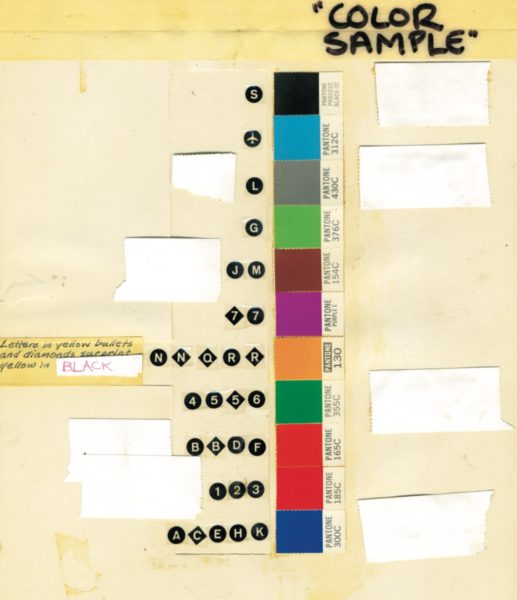
Hertz Associates came up with the idea of identifying subway routes by their Manhattan trunk lines, despite branching elsewhere. These Pantone colors are still in use today.
After our email exchange, Hertz wrote a free-flowing series of posts both defending his map and explaining it. In Part One, he started out with a vigorous defense of The Map and his neighborhood inserts (and threw some shade at casual designers who did not have to answer to clients). Part Two tackled the Vigenlli Era. Hertz spoke glowingly of the Vignelli diagram but detailed why New Yorkers had such a visceral reaction to it. Part Three was a fascinating look at the MTA’s late-1970s visitors guide and the decision to introduce trunk lines by color to the map, and Part Four ended with a discussion on those colors. Hertz had expressed a desire to continue the series, but the modern history of the map never materialized.
I’ve also been partial to the current redesign of the Vignelli map. It incorporates Hertz’s trunk line color scheme while addressing some of the earlier complaints about Vignelli’s confusing diagram. The water is now blue, but without parks or other landmarks, it’s very much diagram. Still, I’ve grown to appreciate Hertz’s map over the years too. The decision to go with trunk lines helped simplify the map for every-day users even while leading to confusion for tourists and other occasional riders. Still, his map is very much of and about New York. The city is identifiable, and the routes of the subway are too. The 1979 version is cleaner and crisper with whiter whites (rather than beige) and colors that seem to pop more,
 As 2019 draws to end, I wanted to release one more podcast episode, and this week, you get to spend a half an hour with me and


 Meanwhile, if you look at the normal markings for a terminal, the colored block with the line’s route designation usually appears right near the white circle designating the terminal. You can see it above for the L train at 14th St. and at right for the 7’s eastern end in Flushing. Here, the purple square is underneath the word “Yards” and next to the handicap symbol and another 7 that’s just sort of floating there. It should be under the black circle denoting the station (and that black circle should be white since both local and express 7 trains will service Hudson Yards). Yet, placing the purple block would cause conflicts with the designation for the 8th Avenue’s Penn Station stop since the avenue spacing here has been distorted for design purposes. Instead of adjusting a geographical inaccuracy, the map designers just shoved this thing wherever it could fit.