 Nothing screams New York City quite like the subway map. The iconic map — or at least the 1998 redesign of The Map — appears in every guide book about to New York and is a ubiquitous decoration in subway cars and stations alike.
Recently, the map has made a few cameo appearances in the New York media as well. The ever-popular Best of New York issue of New York Magazine hit the stands this week. Featured on the magazine’s Web site is an artistic spelling of the words “Best of New York” as told by a folded-up subway map. Might that be because, despite all of its problems, the subway system is one of the best things about New York? I think so.
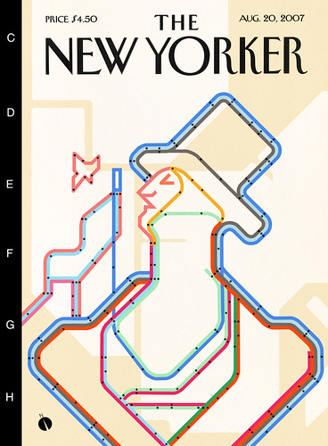
But more fun than the New York feature is an homage to the subway that appeared in the pages of The New Yorker a few weeks ago. Every year, near the February 21 anniversary of the debut of the venerable magazine, Eustace Tilley appears on The New Yorker cover. This year, the magazine opened up the Eustace Tilley design to readers and graphics designers across the country. While the Tilley issue came adorned with a Hillary/Obama cover, the winning submissions — online at The New Yorker website and Flickr — were quite entertaining.
To me, one jumped out from the pack:

That’s right; it’s a Massimo Vignelli-inspired Eustace Tilley superimposed over the stylized map of New York City. Drawn by flickr user panutfla, the Tilley subway map evokes New York and the subways in all its glory. It is the quintessential image for The New Yorker, and while he magazine didn’t honor the underground veins of the city by placing this image on the cover, it is by far one of the most New York-centric images from The New Yorker I’ve seen in a long time.

1 comment
It was a great entry! And well-executed.