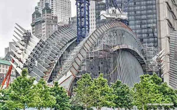
My thoughts on the Santiago Calatrava-designed PATH World Trade Center Transportation Hub are no secret. It’s a multi-billion-dollar monument to the Spanish architect’s ego that does very little to enhance transit capacity or the aesthetics of the World Trade Center area. As the structure has arisen, it’s lack of visual appeal has become more obvious, and although its completion is a fait accompli, it’s still worth dwelling on the process. In fact, I’ve asked Port Authority, through a FOI request, for information regarding fees paid to Calatrava and his firm.
Meanwhile, in The Post on Sunday, Steve Cuozzo absolutely eviscerated the transportation hub. He doesn’t chart new ground, but his takedown is, to borrow an overused phrase, epic. He writes:
With each passing week, the embarrassing ugliness of this $4 billion boondoggle designed by Santiago Calatrava — a hideous waste of public money — grows plain for all to see. Not everyday-ugly, like a tacky brown tie or dress, but LOL-ugly. What are those spiky “ribs” and “wings” doing next door to 3 World Trade Center and the memorial pools? What happened to the “bird in flight” we were promised?
The elephantine excess won’t be fully realized until the scheduled opening at the end of 2015. But as the dragon slumbers to its feet, enough of it’s reared its head to give a sense of what the finished fiasco will look like: a self-indulgent monstrosity wildly out of proportion to everything around it, and 100% aloof from the World Trade Center’s commercial and commemorative purposes.
Hey, what’s wrong with a train station? Nothing — but today’s 40,000 daily PATH riders make do very well with the current temporary station. And the Hub’s vaunted subway line connections could have been more efficiently achieved with a simple passageway than an “Oculus” longer and taller than Grand Central Terminal’s main hall.
Having seen the parts of the Hub that are already open to the public, I’ve witnessed first-hand what Cuozzo terms “sterile and intimidating.” The floors are solid, slippery marble, and the dominant color is white — not what you’d choose for a New York City subway station bound to attract dirt, debris and all manner of grim from the surrounding environment. It’s a museum to an architect in which practicality was an afterthought if it was even a thought at all.
Cuozzo questions the architectural support for the structure and ponders who will shop in the underground mall. The latter point is less of a concern because New Yorkers and tourists tend to gravitate toward these kinds of shopping centers if the mix of retail is right, but the fact that not one but two under-built transit hubs with high-end retail are opening a block apart from each other at a time when the city desperately needs more space for housing makes me question the spending priorities and long-term planning for the city’s transit agencies.
Ultimately, it’s too late to stop the transit hub, and it will be with us for decades. But it’s a reminder of excess and poor planning. Will we learn anything from this mistake or just be doomed to repeat it, billion-dollar overrun after billion-dollar overrun, while transit capacity concerns go ignored yet again?
Leave a Reply