
When the MTA unveiled its redesigned subway map last month, I spent a lot of time focusing on the inside. In light of the new design of the schematic presentation of the subway system, I explored what purpose a subway map should serve and wondered if The Map was the best representation of subway service.
Lost in the hullabaloo over the inside was the new look for the outside. Check it out:

To me, the outside cover of The Map is the best part of the redesign. Gone is some skewed view of New York City with an arrow that’s far too big and intrusive. Gone are the connotations that somehow, the subway extends beyond the borders of the City of New York.
Instead, the MTA has chosen an artistic approach while highlighting the fact that you have a subway map in your hands. The route bullets are all on the front for the first time since early 1995, and the colorful lines are evocative of subway strip maps. A larger version of the image could be hanging on the wall at MoMA, and that is the sign of a design that deserves to be seen.
 When it comes to problems plaguing the MTA, billions of dollars of debt isn’t exactly a sexy topic. On the surface, it doesn’t impact people’s lives as service cuts do, and it has little to do with the public mistrust of MTA management. Yet, whether riders realize it or not, the price we pay today in fare hikes and service cuts all comes back to debt.
 When
When  Later this evening, MTA Board members and angry union members will square off in a pair of public hearings. Despite voting to cut the station agents in early 2010 and holding hearings on a nearly identical proposal a year ago, the MTA had to host these public open houses to placate a Manhattan Supreme Court judge who found that the MTA’s dismissals this year for plans approved last year violated the law. What the hearings tonight will accomplish is very little.
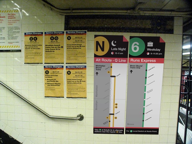
 Posters proclaiming the various weekend service changes have long vexed the MTA. Once upon a time, the posters were a stark of black, white and red with some information tossed all over the place. In mid-2007, the authority


