
When it comes to weekend service changes, the MTA has been laying it on hot and heavy for the past few years. The work is all part of a significant capital investment that keeps trains moving smoothly and frequently during peak hours, and the authority has opted to accomplish most of the work during the weekend when it is less disruptive to those who need the subway system. What they often don’t do is thoroughly inform the public of the changes.
 Posters proclaiming the various weekend service changes have long vexed the MTA. Once upon a time, the posters were a stark of black, white and red with some information tossed all over the place. In mid-2007, the authority redesigned the signs to better present the information.
The results were something of a mixed bag. With no visual component outlining the service changes in map form, riders were left with signs, such as the one at right, with too many words and confusing information. What does it mean for one train to “run on the F” from one stop to another? Veteran straphangers might understand MTA shorthand for a reroute, but casual subway riders won’t be able to picture the diversion or know where the train goes.
The current signs also contain too much useless information. when the MTA rhetorically asks “Why is my service being changed?” the answer is usually always the same: “We are performing XXX work to make sure that subways continue to operate safely along the X line.” That the MTA is ensuring that subways continue to operate safely adds nothing to the informational value of the posters nor does it help riders know what to do.
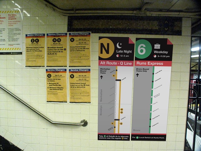
A few months ago, I came across a posting on the blog featuring work of students who are in the MFA program at the School of Visual Arts. Those working Interaction Design had tackled the subways, and one designer — Russ Maschmeyer — came up with the sign atop this post as a better way to present weekend service information. He writes about his design:
For any transit system experiencing redirects, there are four key messages that need to be conveyed: alert the riders to a change, provide a quick overview of that change, course correct any wayward travelers, and finally, guide riders through the hallways to the proper platforms. If done right, no one should have to stop to study a sign, but study them we do. Currently, the MTA employs a single, densely packed sheet of 8.5×11” paper to convey an entire set of messaging. This is a problem worth solving.
I approached this problem with the aim to stretch out that messaging over the rider’s entire subway experience, from entering the station, to the turnstiles, to the platform and then onto the train itself. I devised a simple hack to the current station entrance and turnstile signage involving LEDs surrounding the train symbols, as well as the LED route boards on the new R160 trains, which would alert riders to service changes and cancellations. Once inside the station or on the platform during a transfer, riders would find redesigned fliers, which would include iconography, a strong information hierarchy, and a map of the service change. This is of course just a beginning, but hopefully these small changes would go a long way to making these changes a bit more digestible.
I’ve written recently about the MTA’s customer service woes, and these signs along with Maschmeyer’s resdesign show the MTA could better inform its customers. The agency should, at the least, make a map with the service changes available on its website as Subway Weekender does, and the in-house design team should consider a more visual approach to the service changes. Little upgrades such as these would make the subway system more user-friendly, and maybe New Yorkers wouldn’t be so begrudging of their subway system.
Photo above via SVA Interaction Design on flickr.
18 comments
I do like the visual of the service-change hacked signs. And considering that the existing service-change signs are already printed out in four colors, it wouldn’t be more arduous to generate the new signs. My only reservation is that they might have to keep the 8.5″ x 11″ size just so they’re easier to duplicate in large numbers (to paste up in subway trains as well as stations).
I agree that a map would, in almost all cases, be better than words.
I also agree that they should drop the “Why is service being changed?” section, which never conveys useful information.
The agency should hire SubwayWeekender. That is all.
The service advisories are one color printed – black. The pages themselves are pre-printed, and then fed through B/W printers to print the actual info regarding the service changes. While the proposed signs are graphic and prominent, they’d get expensive to print for all the TA’s changes every week.
I agree, though, that the current signs are not effective (too much info, poorly communicated). The bigger problem is there are so many different changes to individual lines, you often get 3 posters for one line because of unrelated rehab work. Consolidating repair work would go a long way to simplifying interruptions.
I’d be happy if the MTA just brought back the word “TO” on subway destination signs. An electronic sign that reads “R/Broadway Local/Bay Ridge/95 St” is very confusing to someone not familiar with the NYC subway. How about “R/Broadway Local/To Bay Ridge-95 St, Bklyn”? At least the rider will know it’s a Broadway Local heading TOward Brooklyn.
The worst is the IRT Lex-Jerome, which simply reads “4/Lexinton Ave Exp/Woodlawn.” How the hell is anyone supposed to guess that this train is heading uptown toward the Bronx? To new riders, Woodlawn may as well be a suburb of Cleveland for all they know. How about “To Woodlawn, Bronx via Jerome Ave” like the old signs used to say? If the old roll signs could convey this info, why not new (expensive) electronic signs?
The most disturbing one I saw was the other day; something like “N/Broadway Express/Via 59 St/Astoria/Ditmars Blvd”.
“Via 59 St”? Really?? What does that add?
Especially because it’s not even going under 59th St.
It’s going under 60 St.
But the stations are all 59th Street. Most lines have the street they make their crosstown journey. E has via 53rd. F has via 63rd.
The “To (Destination)” is actually on the R143s & R160s on the interior displays and should be on the R142s.
I think they took it off all the exterior signs because it usually ran over the sign length, especially on the longer names like Metropolitan Av or Eastchester-Dyre Av.
Not an excuse. The MTA could abbreviate Metropolitan Ave to “Metro Av”, and there’s no reason to put Eastchester/Dyre Ave when “To Dyre Ave, Bronx” fits easily in the space available. How many NYC subway riders know/care that Dyre Ave is in Eastchester? How many go to the end of the line compared to the main portion of the route? The MTA didn’t add “Eastchester” until new cars came into service a few years ago. And if the word “TO” doesn’t fit, a simple arrow such as this: > 95 St/Brooklyn would suffice.
Oh bravo! I’d buy that kid a pizza and beers. (Seriously!)
-danny
Mike Hertz outghta hire that kid.
When they first redesigned the flyers, the “Why is service being changed?” section used to be WAY more descriptive. It would say something like, “We are replacing network cables between 137th St and 145th Street as part of a public address system upgrade” or something like that. You actually felt like they were doing something useful…
I’ve had the experience of standing in a station on the weekend, watching a train go by (with lettering different from the usual train on that route), looked at the service changes sign, looked at the train, looked again at the service changes sign, and eventually just concluded “wtf”. I would reread the sign several times and have no idea why that particular train was going through the station or to where it was ultimately headed.
Part of it is the Rube Goldberg complexity of much weekend service, but it actually looks in some cases like they are deliberately making the signs confusing. Especially since I remember years ago that the signs made some sense.
However, I think what is causing the confusion is a desire to avoid the impression that service is being cut. So you usually don’t see the words “no” or “not running” on the service changes signs, as in “no Uptown X train service this weekend, the Y train will substitute for the X through these stations but not through this one part of the route.” Sometimes the conductor will announce a service change this plainly, but I rarely see it expressed so directly in writing.
Seeing the moon-crescent in these pictures gives me an idea. Why not just put the crescent right inside of the route bullet like on the Venice vaporetto (waterbus) (see the “N” route)? It saves some wording, and makes it easier to see at-a-glance whether or not the poster might apply to you.
Even the MTA’s previous notices, with the bright red box reading “LATE NIGHT” or “WEEK-END” was clearer than this one.
Seriously, just read the signs. I think we have bigger fish to fry here. Sure if they can improve them without increasing costs, go for it, but there are plenty of more pressing matters to worry about.
There are a lot of subway riders for whom English is not a first language. It is a genuine issue.
[…] have to ask if these signs are an improvement. Just a few months ago, I explored how Transit could design a better service change poster, and these redesigns come close to achieving those goals. They’re more visual than their […]