
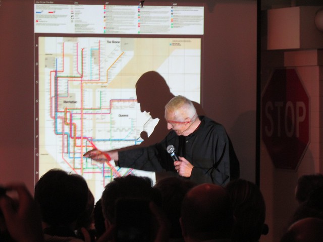
Massimo and his map. (Photo by Benjamin Kabak)
For as long as I can remember, I’ve been a fan of maps. I enjoy the way various graphical representations can serve to show the way a city works, and to me, it’s fascinating to see how map design impacts map usefulness. A schematic/diagrammatic map may show the best way to get from Point A to Point B without extraneous detail, but the extraneous detail may be necessary to get to path of travel from A to B. Essentially, there is no right way to present a map, but the philosophy of cartography and graphic design can heavily influence how a map is used by its intended audience.
In New York City, this debate centers around the subway map. Today’s subway map is not a work of great design, and it tries to be everything to everyone. New Yorkers demand a semblance of realism in their map and have long wanted major landmarks on the subway map. Tourists, meanwhile, seem to treat it as a navigation aid even though distances are distorted and few streets can be found on it.
Over the years, New York has toyed when varying approaches to the subway map. Early IRT representations showed Manhattan on its side, and over the years, unified system maps ranged in form from geographic to abstract and bubbly to some mix of both. No map, of course, engenders more discussion or debate than Massimo Vignelli’s schematic — the only subway map in the Museum of Modern Art and the only one to start Internet commenting wars.
Over the past few years, Vignelli’s map has enjoyed a resurgence. Men’s Vogue sponsored an update in 2008, and MTA’s Weekender map has delivered Vignelli to the digital realm. The designer himself participating in a robust discussion on form and function at the Museum of the City of New York nearly two years ago. So with the Weekender’s arrival, it was natural for the Transit Museum to sponsor a panel featuring the 81-year-old Massimo Vignelli and his two younger associates, Beatriz Cifuentes and Yoshiki Waterhouse, who both had key roles in updating Vignelli’s map for the 21st Century.
By and large, the panel was about Vignelli, his map and his design philosophy. In an venture, he has tended toward crisp lines, sharp angels and minimalism. That is, in fact, what he did with his subway map that proved so controversial. For him, he explained on Tuesday night, the subway map should show what the subway does and nothing more. “Who cares if the subway has to go around like that,” he said during his talk, pointing to the curve Montague Street tunnel on the current map. The conductor drives the train while the passengers simply want to know how to get there.
Throughout the course of the talk, Vignelli made it perfectly clear that no one loved and appreciated his map more than he did, and that’s likely true for any designer. It took a forward-thinking MTA head in William Ronan to allow modern design into the transit authority, and it took another — Jay Walder — to bring it back for the Weekender. The problem with Vignelli’s map, though, isn’t its look; it’s the functionality.
As Vignelli admits, the now-iconic subway map, so evocative of a different era in American and New York City history, was supposed to be one part of a four-piece system. We know about the verbal map which explains that one must take the D to the F to travel from Atlantic Ave. to Forest Hills; we know about the neighborhood maps that show the area around the subway station. Vignelli mentioned on Tuesday a geographically accurate map that he never produced as the third piece, and of course, the map with its route lines and 45 degree angles as the centerpiece.
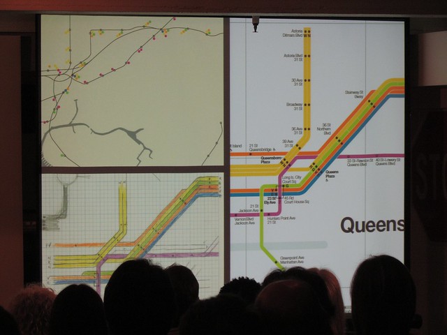
Vignelli’s Queens, in progress. (Photo by Benjamin Kabak)
For Vignelli, simplicity is key. “Line, dot, that’s it,” he said. “No dot, no stop.” Had the designer had his way, the subway map he made would have been even more minimalist with no water, no parks and just a nod at borough boundaries. It assumes a level of knowledge with the above-ground world that is still required today.
Vignelli’s map always faced a lot of criticism though. The colors were too numerous, and some stations weren’t in the right place. In the late 1960s and early 1970s, he didn’t have GPS locations and precise station data, but still, it wasn’t quite right. The newest version corrects those flaws and simplifies the color scheme. Today, it’s in use as The Weekender, and Vignelli and his associates acknowledged how much better suited that map is to a digital realm.
With the need to show different service patterns at different times of the day, Vignelli believed digital maps are the future. “That’s why printing is dead,” he said. “It doesn’t make sense to print a map.”
Of course, there’s still a public part of Massimo Vignelli that wants to see his map return to greater use, and he admitted as much. As the MTA wires its stations and brings technology underground, the easy translation from the page to the web for the Vignelli map may keep it alive longer than anyone would have thought after it was replaced in 1979. “The Weekend should become the week-long official map,” Vignelli said. Perhaps, with the right changes, its time has come.


