
Over the past few years, I’ve often examined the debate surrounding the New York City subway map. The map is far from perfect, and functionality and form often fight it out with design and readability emerging as the losers. While recent redesigns have pared down the extraneous information, the subway map is an incomplete glimpse at the subway system as it runs during certain hours of the day. For all of that, the bus maps are even worse.
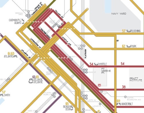
Most notably is a lack of a comprehensive bus map. There is no publicly available map that unites bus service in all five boroughs. Instead, the maps focus on individual boroughs with some interborough express bus service highlighted as well. Even still, they are borderline illegible. Take a look, for instance, at the inset of Downtown Brooklyn available on the latest version of the borough-based bus:

It’s no wonder New Yorkers often find the bus system so hard to untangle when the visual representations do nothing to help. It’s almost easier to say what’s right about this map than what’s wrong. The New York City grid is very easy to follow here. Otherwise, colors, lines, shapes, arrows and numbers all bleed together to create something often harder to unpack that even the world’s toughest maze.
These days, it seems as though the MTA has given up on the bus map. The notes on the back are as tough to follow as the schematic on the front, and those in the city who rely on the buses learn their routes through either trial and error or the the strip maps on the bus poles. Admittedly, it’s tough to represent the bus system graphically, but with no rhyme or reason to the map’s colors, the current iteration fails.
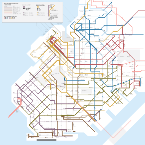
Enter Anthony Denaro. The third-generation New Yorker has redesigned the Brooklyn bus map to show how one might better illustrate the system. Noting that the current map “lacks visual and operational organization strategy” and “underplays transfers with subway stations,” he introduces a map simplified by hub. The hubs are centered around Williamsburg, Ridgewood, East New York, Downtown, Bay Ridge, and Coney Island, and buses are grouped by color. “Riders,” he writes, “can make an approximation that a line will travel towards their neighborhood and ‘localizes’ those routes to their neighborhoods.”
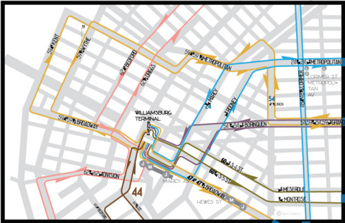
Here’s the same Downtown Brooklyn inset:
What this move loses in geographical accuracy it more than makes up for in terms of readability. Overall, it’s much easier to trace the path of a bus and get a general sense of where the route will take a potential rider. Furthermore, instead of a confusing mass of information on the back, Denaro’s map offers neighborhood insets too. Here’s Williamsburg with subway transfers shown:
Right now, it’s clearly a work in progress, but it highlights a problem often ignored. If people can’t understand the bus system, they’re apt simply to ignore it. By presenting a map that makes more sense — one that is organized and color-coded — the MTA could indirectly encourage potential riders to hop on the bus. After all, knowing where you’re going is half the battle.
28 comments
Three obvious problems:
1. This map really doesn’t know what to do with buses that connect two hubs.
2. Near the hubs there are a bunch of routes serving very different destinations all with the same color.
3. There’s no distinction between frequent and infrequent routes.
4. Geographical accuracy actually matters more when there aren’t fixed stops indicated. Roadways and cross streets are critical reference points.
I think, like it or not, the current borough bus maps are about the best of a bad job, except for that frequency thing (thinner lines for more infrequent routes?). IMHO, critical buses should be better indicated on the subway map.
I think the keyword is better, not perfect. There’s no way the current bus maps are the “best” of anything.
Better is debatable. Interesting is the way I would describe it. Given all the problems with the bus system, and I could write a book on that alone, I think the bus map is the least of the problems. In fact, I’d say it is one of the few areas in which the MTA has exceled. The bus maps we have today are the best we’ve ever had, and the colors are not as arbitrary as they seem. Colors are chosen like the old Vignelli subway map to make it easy to trace a route on the map so that unless two routes share a common destination, the color of every route on a given street is different. That’s why as routes are revised, the colors of the routes on the maps change also.
Accurate geography is more important on a bus map than on a subway map, since you need to know how far you will have to walk after getting off the bus.
Also, the hubs are not nearly as important as the new map makes them out to be. It doesn’t matter if a bus route takes you to Bay Ridge. You need to know where in Bay Ridge it takes you. The only real important hub is Downtown Brooklyn. And who is to say that East New York which isn’t even a hub but a neighborhood is more important than Kings Plaza which is not considered a hub?
If the NYCT is to be criticized at all regarding its bus maps, it is why it took from 1953 to around 1980 to produce a decent map. The ones from the mid-sixties (the only previous attempt) was a disgrace. At least in 1981, the first real Brooklyn Bus Map was very decent and it has only improved since. And I can even take some credit for that very first map. Just as it was about to go to the printer, I was asked to take a look at it, after just being hired. I found 96 errors after it was proofread. The presses were stopped and it was issued with only five that got past me.
Yes, the route numbers are a problem. I could devise a better one that plays more to the street grid. Examples: B68 (B10); B49(B20); B41(B25); B44(B30); B46 (B50); etc. B63 (B5); B67 (B7); east west routes in north Brooklyn could all end in 1 (11, 21, 31, 41, etc). But still, it is a small problem.
Other than service irregularities, the major problem is outdated routes and service gaps (which the new map makes quite obvious). One needs to get to wherever they are going with only one bus transfer. That is not possible with the current system, and last year’s service cutbacks made connectivity of routes a bigger issue.
Redesigning the map or changing route numbers at this time is like rearranging the deck chairs on the Titanic.
The major problem I see with the current maps is they’re huge and you have to squint. I’m not sure the diagram even fixes that.
I have to agree with BrooklynBus that hubs just don’t matter that much. People are more likely to care about their subway connection than what hubs or terminals their bus serves. Geographical accuracy is absolutely something that would be horrible to lose.
I agree with you about the subway connections and bus terminals.
Further, if I were to revise the colors, rather than basing it on hubs, what I would do is use the same color for parallel routes in a specific geographic area as long as the routes don’t cross. It would still be easy to follow a route and the colors would not appear so random.
Well, on the computer (or on a phone) you can zoom the map to whatever size you need. I don’t use the paper maps anymore, for exactly this reason.
The current map is not the best of anything (frequent network, please), but it is better, because it uses color to dissimilate routes that could otherwise be confused.
The current map is geographically accurate and readable – albeit with some effort. I agree the key piece of information missing is frequency, and even that’s a little bit of a can of worms (what times of day?). Other than that, it’s hard to do much better given what we have.
Off-peak frequency, of course. But how to define off-peak is a can of worms – small cities usually do all-day until some time in the evening, say 7.
Following Cap’n Transit, my maps look only at the afternoon off-peak, but use a relatively tight 10-minute standard, in accordance with New York’s relatively high-quality transit.
The lines are colored so they can be distinguished from one another – poorly. Each line should use its color, and the width and style of the line to explain frequency and service: does it operate on weekends, rush hour only, late at night, at high frequencies during rush hour, etc. This should also be combined with excellent graphic design, but that’s getting a few steps ahead of ourselves.
In the 5 boroughs, there are only maybe 10-20 bus routes I would ever rely on unless I had no other choice. These should be highlighted and promoted everywhere as they really do represent amazing and useful services that people should be aware of (starting to happen with the select bus routes). Compared to the more infrequent routes, they represent a world of difference. Compare the M50 to the M15, for example. The only downside of living in a city with excellent rail transit is that buses have been relegated to second or third class by most of the subway riding public, and subsequently ignored.
Ideally, there would be a huge wall map at every station (in addition to the diagrammatic subway map) that showed all the bus and train lines in the region, including long island bus, NJ transit, the bee line system, etc. Assuming the MTA is incapable of providing and maintaining such a thing, I’d at least settle for a map that shows all the MTA bus services in the 5 boroughs. Even now, the Manhattan bus map leaves off every express bus route that serves the island – a huge number of transit options. For example, unless you already know which route to take, or you have the internet at your fingertips, there is no way to figure out how to get to Fresh Meadows or Queens College. The express buses that serve those areas are not shown on the Manhattan bus map, and one cannot get a copy of the Queens bus map in Manhattan. At least this is better than New Jersey Transit, which has always deemed it beneath them to produce any kind of bus map whatsoever.
They do have the neighborhood maps, but have not made them available all over.
He’s saying to make a 5 borough bus map (like the 5 borough subway map) and post it in the stations next to the subway maps.
That would take an awful lot of space.
Yes, it would. Luckily it would be going in a subway station, not my apartment.
I question the idea behind designating Bay Ridge a hub. I think it really weakens the arguments for the other hubs. The other hubs all have buses terminating in roughly the same spot, near a single train station, but the Bay Ridge hub lacks one central stop, it just has a lot of lines crisscrossing the area.
As for designating a bus that connects two hubs, if you can figure out the ridership to see which hub draws more passengers, that might aid in designating the line with the color for the more popular hub.
Altogether, I don’t care for this map, I don’t really agree with the categorization by hub. I think the reason I dislike it is because the coloring scheme is in opposition to the subway coloring scheme, coloring by trunk line, not by hub.
Arguably, and I don’t disagree with you at all, the hub is the 86 St stop on the R where there is a direct connection to the S53, S79, S93 buses, and is meant to highlight the SI connections.
I think that insets are only needed where there are too many routes to easily discern on the map.
I like that the maps are geographically correct, but some bus routes appear as different colors on different maps (e.g. Brooklyn and Queens)
East New York also isn’t a hub.
Good point. I wasn’t sure if there was a hub facility like those in Ridgewood or Williamsburg out near the Broadway Junction station, but thanks for the heads up that it’s not the case.
And Al D, while 86th Street is certainly the hub for SI buses in Bay Ridge, it’s not a real hub of Brooklyn buses. Also, for whatever reason, the map maker suggests 59th St as the hub for Bay Ridge, which doesn’t make sense since only one bus passes next to that station.
This idea is very much a work in progress.
It doesn’t have an actual “hub” facility, but it is a transit hub as far as routes being centered around it (the B25, B83, Q24, and Q56 all terminate there, as do some B20 trips). It just doesn’t have as many routes converging there as Ridgewood or Williamsburg.
One thing that would significantly help and would make bus maps that focus on destination over the street grid is if the buses actually had LED street information. It’s amazing to me that NYC buses DON’T have this information. Bus systems in California, Chicago and DC have long had this kind of readouts and have retrofitted older buses as well. It’s essential information to have on a bus ride where street signs and even the bus stops with their street names are hard to read while traveling.
Several years ago, I suggested lowering the names of the bus stops so they are visible to a standee in the bus. After all, the stop names are for people looking for their stop when getting off. They are not for the people waiting at the bus stops because they already know what they are. In fact at bus stops where four or more routes stop, the lowest route sign is at the correct height for the bus stop name to be seen by standees. Where only one route stops at a bus stop, the route number could remain where it is, but there is no reason why the stop name should be on the same level. It needs to be lowered by several feet.
But as usual the MTA dismissed my recommendation out of hand with a non-sensical answer because of their arrogance that no one could know as much as they do.
Be aware that the Americans with Disabilities Act (ADA) does have signage height requirements – signs such as bus stops, speed limit signs, etc must be at least 7 feet clear of the ground/sidewalk.
I’m not from New York, so I don’t know exactly how high they are, but just wanted to say something – if it’s due to ADA, it’s out of their hands and with the Federal government. How arrogantly they communicated with you would be another matter.
Yuck, yuck, yuck! I like the current map, it’s a lot better for those who need to get an idea of where the route goes geographically (and thus route travel time). When I plan, this is what I do:
Find your destination, if it’s not a major hub, note which routes serve it. Then trace back each of those routes, starting with LTD buses, until you find the fastest and/or shortest option. It usually works, and isn’t terribly hard for someone not familiar with the network to do. (I do it on WMATA maps too)
The Downtown Brooklyn inset and location is the most incomprehensible part of the MTA map (and should be redesigned or blown up even further). Other boroughs and insets tend to be acceptable and can stay as is.
I do agree, though, that the back of the maps need to be redesigned and a Manhattan Express map created.
I’ve never had a big problem with the various boro bus maps. I’ve lived in 4 boros and traveled via bus in all 5, and the maps seem clear enough to me. I’ve never got lost riding a bus in the city after viewing a bus map.
There routing system itself could be more logical than it is. Why is the First Ave bus the M15, the Fifth Ave bus the M1 and the Third Ave bus the M101, other than historically that’s what they’ve been called?
The MTA did some decent changes when they numbered the crosstown buses after the street they run on (ie: M42 is the 42nd St crosstown) and put in a somewhat logical system on Staten Island by grouping all the buses by geographic area served or main route they travel on. For example, the Victory Blvd buses used to be S6, 106, 111, 112 but became S61, 62, 66, 67 to show that all Victory Blvd buses are in the “60” series. All North Shore buses are in the “40” series, all Hylan Blvd buses are in the “70” series, etc. I don’t think they did this in other boros, and Brooklyn does seem a crazy hodgepodge of numbers. The maps themselves, however, seem OK to me and I don’t think they discourage riders or make it hard to figure out where you are (unless you suck at reading maps, which many folks do no matter how logical they’re laid out).
Guess whose idea it was to renumber the M106 to the M42 and the other crosstown routes? It was mine and I even have proof because I suggested it in 1974 in a letter printed by the NY Times when the MTA did some other Manhattan renumbering to eliminate three separate M15 routes. (One was just called #15 as if that was less confusing.) They also eliminated a half dozen other duplicate numbers. They didn’t listen at that time and just renumbered the routes sequentially as they always had been doing.
But when I suggested it to the head of Operations Planning in 1984 when being interviewed for a job, he told me that he didn’t see the point in using the street name for the route number, but guess what? Three weeks later he made the change, and also didn’t give me the job. Never said thank you or admitted that I suggested it to him. And you wonder why I am bitter toward the MTA.
I also suggested numbering the Avenue routes similarly, calling the First Avenue route M1. Calling it M2 down second. M3 up Third, M4 down Lex, etc. More than one route on a street could have suffixes such as M5, M5a, M5b, or something similar. I still think it should be done that way.
I’d love to see a comprehensive, understandable redesign of the bus map and would agree the geographic accuracy is one of, if not the most, crucial element to keep. Think about not just who occasionally take the bus, but the elderly and stroller moms and wheelchair bound people who have limited mobility and really need exact locations. The other thing that comes to my mind, is the lack of recognition of the existing bus map. While the subway map, quirks and all, seems to be etched in all NYers minds… my gut says the overwhelming majority of us have rarely seen a full borough wide bus map. As some commenters above suggested, bus shelters need large scale maps, much like the DOT’s half-assed bike ‘shelters’ have been equipped with . I know Ad space is key to revenue so some at MTA may cringe at the thought of giving up ad space, but no point in selling ads on a bus system no one takes because they don’t know where it leads.
[…] Transit has explored the idea of frequency maps for bus service, and others have taken a stab at streamlining the visual presentation. Yet when the MTA overhauls its maps, the subway diagram gets some cosmetic upgrades while the bus […]