
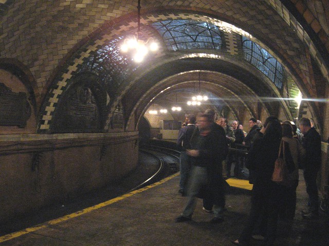
Once upon a time, subway stations were architectural marvels. (Photo by Benjamin Kabak)
The history of architectural design and the New York City subways is a tortured one. The system’s nicest station was also its first, and it’s been all downhill since then. Maybe that’s why New Yorkers have such a love-hate relationship with the subway system that powers the city’s economy and why straphangers are so dismissive of their underground atmospheres.
When the first subway stop opened at City Hall, it was an architectural marvel. With sweeping Guastavino arches, the Heins & LaFarge-designed station eventually landed on the National Register of Historic Places, but no other station in the system looks like it for one reason: cost. It was far too expensive for the city to build such ornate complexes at every stop, and instead, the IRT builders adapted a cheaper mosaic-based tiling. Today, many of those stations are in need of repair and, as a result of their depths, suffer from water damage. The tiling and mosaics, though, are historic reminders of the early days of construction.
Over the years, subsequent builders maintained tiling to a point. The IND stations used a complicated color pattern to mark various stations, but eventually, pragmatic concerns over cost and so-called modern designs turned new subway stops into giant nothings. The Archer Ave. extension stations are unforgettable, but at least they’re not bright orange like the 1970s reworking of Bowling Green. The “experimental” redesign at 49th Street also dates from the 1970s. It is not a proud moment in subway history.
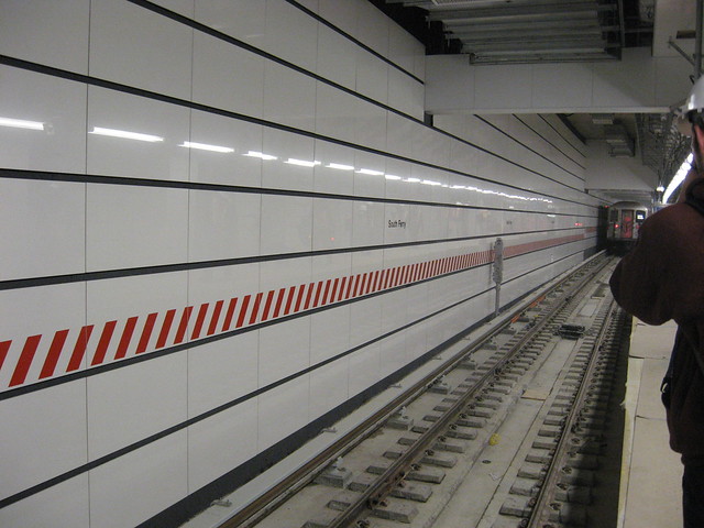
Today's modern subway stations are more evocative of sterile hospitals than anything else. (Photo by Benjamin Kabak)
Finally, in the modern era, stations are simply bland. The new South Ferry terminal is a sterile white room, and the Second Ave. Subway stations, based on early renderings, look to be more of the same. While I’d say that a few billion dollars doesn’t go that far when it comes to design, the MTA will point to the Second Ave. stations as examples of current design. They stations are wide, spacious, airy and ADA compliant. Beauty is in the ey of the beholder.
But what of the architectural community? Recently, Mark Lamster, writing at The Design Observer Group’s Observer Room blog pondered the lack of attention paid to transit design. While public pedestrian plazas and bike lanes have received the bulk of the attention, we continue to ignore the way the subway system looks. He writes:
Progressive members of the design community love cycling, and I think not just because it is a healthful and environmentally sustainable mode of transportation. Designers, I suspect, are attracted to bikes because designers love making objects—it is what they are trained to do—and the bike is an object that is simple enough that anyone can tailor it to their own specifications…
I wish designers cared as much about mass transit as they did about their bikes. We don’t get very many articles in the design press about our decayed subway system, nor does there seem to be much of a galvanized movement within the design community to do anything about it…Transportation Alternatives, a wonderful organization, bills itself as an “advocate for bicycling, walking and public transit,” which seems bizarrely out of order to me. When the design (and architecture) press covers mass transit here, it’s often to wax nostalgic about Massimo Vignelli’s map of the system—wonderful, I admit.
New York is never going to be Amsterdam. Commuting by bicycle may work for some people, and the more the better, but for the overwhelming majority it’s not going to be a viable option most of the time. New York is a city of public transit, and that’s where the vast majority of our attention should be directed. It is the single most important urban design issue facing the city and its residents. By far. More than 5.1 million rides are taken on the subway on an average weekday. Bus service adds another 2.2 million. Service cutbacks loom. Last week I renewed a Metrocard for a month. The fee was $104. The fee for renewing my driver’s license for ten years? $80. Our priorities need to change.
To me, the issue of design is one of attention. The public faces of the MTA are a bunch of stations that look like they were designed seventy years ago and were never modernized. They’re dank and dark and falling apart. Most design elements that were once appealing have faded, and the nicest looking station rehabs — such as at Franklin St. in Tribeca — aren’t at particularly high-traffic spots.
So should we care then about station design and appearance? Does an interestingly designed station that is well maintained attract more riders? Would such a station also make New Yorkers more supportive of their transit system? I’d have to believe so. Transit design should be on the table. Not every map needs to be a jumble of words. Not every new station has to look as bland as a hospital.
55 comments
Setting aside the issue of capital budgeting, the main problem is that the instant that the MTA looks to spend ANY money on any serious design styling for the transit system, the conservative politicians (of both parties) are going to jump all over them about the MTA “wasting taxpayer’s money”. Until the political discourse about transit in New York is shifted out of Albany partisan bickering and back into reality, we’re going to be stuck with more South Ferry stations.
Good station design doesn’t cost anymore than all the bad designs that cost millions. Inertia and Lifers at the MTA assume they know exactly what is best which is why we get government bland. But I will take sanitized hospital any day over the filthy stations in Downtown and Uptown.
Why does the brand new South Ferry Station have so many damn columns?!
“Why does the brand new South Ferry Station have so many damn columns?”
I’m gonna take a stab and say “to hold up the street above.” Or at least stabilize the old South Ferry station just above it.
Agree with comment above. I would like to add that the transit brings 4 million dollars in economic impact to Manhattan daily yet we have politicans wanting to slash MTA funding, they don’t use the subway everyday. I want our politicans to realize that reinvesting on our infrastructure makes the economy thrive and letting it rot costs more money in the long run.
Only $4M? I would guess the economic impact in wages alone is in the hundreds of millions, and the economic value of the work all those people are doing in one of the most advanced urban economies in the world is probably easily in the billions – yes, every day.
Great post Ben, and I’d agree with Mark Lamster’s point. Its diaogue like this that will spark someone at the MTA to open a process now closed.
I miss the old tiles in the stations. Some along the “C” Line are just amazing, same with the Lexington line. We need more stations like that and not like 49th street.
A tough blog! Yes, South Ferry is a boring design, and 49th & Bowling Green are garish,but it isn’t all bad,is it? The stations & passages at Atlantic & Pacific in Bklyn were redone and I was glad the respected (and in some cases, extended) the designs of the IRT & BMT stations.
It’s hard to spend on design when folks – and not just conservative politicians – ask why not spend that on a school, or police, etc.? It’s a hard choice to justify.
I think the new #7 station has the potential to be spectacular and I hope the design is intricate to he space and not tacked on at the end as “added art” like often happens.
I think things like South Ferry are bland, but at least they aren’t destructive. Overall, SF seems like a useable station – not particularly beautiful, but functional. If we’re going to have a budget for aesthetics, I say start with the mosaics that are crumbling. Chambers on the J is long overdue to be restored – and that’s right under City Hall. I’m sure no one important really notices because, even if any politicians take the subway, they surely don’t take the J.
I think public spaces could/should be clean because there is no reason for us to pay so much for a crappy environment. But I don’t foresee huge increases in riders from more aesthetically pleasing stations. If we want more riders, we either need to wait for more gentrification or actually take the initiative and build more lines.
I agree with the crux of Ben’s piece– that design must be an essential element of transit construction (we are human after all– aesthetics matter). However, I wanted to add one note about South Ferry. The MTA didn’t completely ignore style/history with the redesign. Yes, the platform itself is boring, but the mosaic showing a topographical map of Manhattan Island on the main staircase to the 1 is gorgeous, as are the barriers between the fare-zone and the station lobby. If doing individual tiling of station walls is indeed too expensive for our historical moment (and I would hope it wouldn’t be), maybe these other types of public art (or displays in conjunction with schools, like those on 86th St), should fill the void.
I think you’re right about the difference between the mezzanine and entry levels at South Ferry and the platform. I love the topographical/historical map of the island of Manhattan, and the historic wall is a nice touch too. But the main waiting area — the subway platform — is entirely dull. I think making the spots where we spend the most time more interesting is a key to design as well. All of the Sol LeWitt murals in the world are great, but if we see them only while descending a five-foot staircase, they are fleeting indeed.
Agree that the South Ferry platform area is dull, but at least it has good lighting and is CLEAN. And to be fair, most riders never see the walls at platform level since there’s almost always one or two trains in the terminal station. Most riders run down the stairs, get on the train and are rarin’ to go. Looking at the walls is not a big passtime at South Ferry.
South Ferry, for that reason, probably isn’t the best example. How about 7th Ave. on the Culver line? That photo is from 2008, and it hasn’t gotten any better over the past three years.
I’ll agree with you there Ben! My best friend lives near that station, and every time I catch a train there I just drop my head. Almost any station on the IND looks like it hasn’t been touched since 1940. Caught a train at Hoyt-Schermerhorn last night, and man is that station depressing. Dark, drab, and the unused side platforms covered in a layer of brown filth. Truthfully, I’d rather see the MTA just spraywash some platforms and replace missing tiles that go all out rebuilding stations.
Heh, I always think the IND stations are the ones that look all right. They actually fixed up many on the A/C lines, such as Fulton, 42nd, and even in the high 100s. 125th looks pretty grungy, but it doesn’t seem to be too bad. My general impression of the 6th Ave. lines and Queens Boulevard is they are at least in good condition, if not clean and sparkly. Haven’t been on the B/D in The Bronx in a good year, but even that didn’t seem so bad. I haven’t taken the A/C towards JFK in ages either.
AFAICT, it’s the BMT stations that look like they’re never touched (Bedford Ave.? Culver was originally BMT, right?). We talked about Chambers the other day….
Chambers on the BMT is a station unto itself. It really is the worst station anywhere, and has been for 20 years. The neglect of a station just yards from City Hall is astounding.
The Culver line is only BMT from Ditmas Ave south. The portion 7th Ave is on is IND.
It’s the Crosstown IND, at that. Makes the whole “Culver Viaduct” thing sound off.
Have you been on the Concourse Line lately? Looks like it hasn’t been touched since it opened in the 30s. The mezzanines, which are mostly closed off nowadays, are in particularly bad shape.
The white glazed bricks (at least they look like glazed brick to me) at 167th and 170th seem to have stood up to time very well, though.
I always had a fascination with the station nameplates on the Concourse, though. The “5” in 174-175th Streets looks amazingly industrial age.
Conservatives who argue that better subway design is a waste of money don’t understand how people think. 50 million people visited New York last year — how many of them took cabs everywhere they went? Lots of them, would be my guess. I’m always astounded at how many tourists I see flagging cabs and how few I see riding the subway. Making the subway a tourist attraction in and of itself would pay dividends.
If you don’t see any tourists on the subway, you ain’t looking very hard. Stand on the BMT platform at Whitehall St after the SI Ferry pulls in, and you can count them by the dozens. Ride on ANY subway that goes near the WTC, but especially Cortlandt St on the BMT, and you’ll be hard-pressed to find a New Yorker anywhere. Go to Times Square on any given day, and see tons of tourists with maps all askew. I see some of them hailing cabs, but my bet is the majority of taxi riders are native NYers who are too impatient to wait for a train.
Not sure what you’re talking about. I always see tourists on the subway and yes they definitely are a tourist attraction in themselves.
Conservatives (those are the Democrats) don’t care about transit. They see transit as a way to funnel money to connected conservative special interest groups, such as the TWU and contractor cronies. Still, the Very Important People all drive cars, including the contractor cronies and many members of the TWU, and they decided long ago that those who aren’t VIPs don’t have importance enough to have their time and economic contributions valued.
But, I have a hard time not seeing the subway as a tourist attraction. People in general flag cabs if they have the disposable income to do so, particularly when they don’t quite know their way. Many of those people both take the subway and use cabs.
Art, from industrial design to fashion, works in cycles. What is celebrated in one era is reviled in the next until it’s so old that it’s “historic” or “retro” and it comes back again. Did people love the City Hall station 40 years after it was constructed, or did they see it as ugly and old the way we see the 70s/80s era stations today?
Also I think comparing things to hospitals is cheap. People have an emotional reaction to hospitals for obvious reasons but I actually find well-designed hospitals to be really nice, calming, beautiful spaces!
Good points, TP. I actually like Bowling Green’s 1970s look, though the MTA (as usual) is absolutely horrible about maintaining this station. It used to have funky, bean-bag chair inspired seating areas that were removed one day and never replaced. And the metal ceiling tiles are missing in many spots, not to mention the cool (and easy to read) signage above the platforms, which also disappeared one day, only to be replaced by conformist, white-on-black signs as in every other station. What could be a retro-cool ’70s throwback is now just another drab (albeit well-lit and relatively clean) station.
Here’s a good shot of the signage and seating design (look behind the guy with the floor-cleaning machine) at Bowling Green before they were removed.
And although we all cry about the bad old days, there’s actually a guy with a FLOOR-CLEANING MACHINE making the floor all nice and shiny! Anyone see that machine in the last 20 years? Nowadays we’re lucky if some dirty mop is dragged across the floor once a week. Wonder what union rule made the MTA get rid of that machine and replace it with three workers doing nothing?
Sorry, here’s the link:
http://www.nycsubway.org/perl/show?115384
Perhaps one of the more annoying results of the MTA’s budget issues and/or union being jerks. Stations that aren’t freshly renovated never get cleaned. How nice would it be to have actual cleaning machines give the platforms some shine.
I do like those resinous floors so much better than chipped tile or bare concrete.
Bowling Green annoys me more than 49th Street for some reason, probably due to the hideous wall pattern on the west wall of the station after the shuttle platform ends.
I know the station is actually a ‘half-new’ one design-wise, since the uptown platform didn’t exist until the mid-1970s and has never had any other tile design than what’s there now, but if they ever decided to redo the station to match the Contract 2 look of the other stations from Fulton Street to Atlantic Avenue, it wouldn’t bother me much (and they can just keep 49th as the official representation of “MTA 1970s station wall tile/brick design”).
The 49th STATE is Alaska!
You meant 49th STREET.
Orange is the official color of Alaska, hence the mistake.
Why wasn’t Bowling Green rebuilt with green tile?
Often wondered that myself. I think the MTA got a ton of orange tile for cheap in the mid-’70s. They had to use it somewhere, and Bowling Green and 49th St were the recipients 🙂
Actually, 49th St has orange glazed brick, which is not altogether unattractive. It’s held up pretty well over the years, and you definitely know whey your train is pulling into that station that you’re at 49th St!
I thought that the orange brick/tile had to do with anti-graffiti efforts. Is that not true?
Might have been, but I think it’s just as easy to clean regular tiles as glazed brick. Back in the day, the train cars were vandalized far more than the stations themselves (at least underground; elevated stations with ugly corrugated metal walls were routinely hit and had to be repainted constantly). And if it were an anti-graffiti measure, I’m sure there were tons of other stations were graffiti was a bigger problem than Bowling Green or 49th Street, which were both in relatively nice parts of town, even in the 1970s.
Very good point about making 49th St. instantly recognizable. That’s even more important for riders with impaired eyesight.
I see that the “49th State” mistake has been fixed by now.
Yes, Alaska is still the 49th State (for now).
After all of the restoration efforts on the IRT mosaics along the 1 south of Penn Station and the R/N stations (save Rector) in Manhattan, I was hoping the MTA would try to replicate the Contract 2 design of the South Ferry loop with the tablets and mosaics of the new station. Instead, the station it reminds me the most of is 57th Street on the F — different tablet style (57th Street was the final evolution of the IND’s evolving tile designs from the post-World War II era), but the same feeling of sterileness.
I’m holding out hope that they’ll do better with the Hudson Yards station, but looking at some of the designs, it looks as if the bland look is the default option for current MTA station designs (considering that tile can now be pre-assembled and put up in modular fashion, I’m not sure why they can’t just try to match the original Squire J. Vickers look and go for some sense of standardization. An ‘old look’ new station might not scream out “progress” the way a all-white tile and bright floor design does, but as time has shown on pretty much every new and/or re-tiled subway station from 1956 on, the modern-sterile look doesn’t hold up nearly as well over time.
Is the problem just the subways? Since WW2 most new design/architecture has been hideous.
Ben, while I agree with you about your points regarding architecture, I do not believe it is the majority held opinion. With funding so scarce, I think most people are just interested in functionality. It is really a shame to see recently modernized stations like 7th Avenue 53rd Street in such horrible condition. Was there yesterday for a long time. The paint from the ceilings hangs down precariously all over. Half the lighting was out. But what bothered me most is how so much of the new floor tiles at this station and many of the others overhauled in the last 10 or 15 years are already falling apart. Where repairs have been made, none of the tiling matches and the MTA has even resorted to ugly concrete patching of the new tile at many locations. I really do not understand why this is happenning since I know all the tile underwent extensive testing before they decided what to use, and it seems none are lasting except the ones just recently installed within the last five years. I also noticed how the yellow safety safety platform ends for the blind just installed at Kings Highway we’re very slippery when wet.
Nice architecture would be good, but it would be better if the new stations coud just stay new a little longer and our system doesn’t have to look like it is perpetually falling apart. And by the way what is your problem with orange?
Function is way more important than form, but form is important. Function can be likened to air and form to water.
I completely agree. The MTA should take care of the basics of providing good service and completing basic maintenance first. As it is I’d say politicians care too much about grand architecture and too little about a functioning transit system, or even a functioning government.
The exact reason why David Gunn got in trouble in DC and had to leave. He believed it was more important to maintain a system that was starting to age while all the politicians cared about was building new extensions.
Think about the Paris Metro, which I think most people would agree has quite lovely aesthetics. The standard station decor is not any more elaborate than NYC: white tile walls and porcelain signage. If anything, NYC has more in the way of tile mosaics and other such ornate touches. I think Paris has two big things going for it: First is the arched cavern design, which gives the stations a dramatic flair notwithstanding their relatively banal finishes. We can’t compete with that, at least in existing stations. But the second we could take a cue from: in Paris, you don’t see nearly the same mess of pipes and wires snaking all over ceilings and walls that you get in NY. This is, in fact, getting worse, as the MTA is installing new ductwork in many stations. I presume this has something to do with upgrading the signal systems and/or providing capacity for CBTC and other new technology. The MTA seems to make little to no effort to install pipes and ducts in a clean, non-intrusive fashion. And many stations are bedeviled by shoddily constructed “temporary” fixtures that hang around for months if not years.
I think that finishing ductwork in an attractive fashion (or, in new stations, keeping it hidden completely in the ceiling and walls) would go long way toward improving the look of the system.
I was hoping that when the Second Avenue Line opened, I would be pleasantly surprised and find some mosaic station names there, but I guess not.
As a side note, I HATE the subway entrances for Second Avenue Subway in the renderings. I get the fact they are supposed to be modern, but can they at least match the rest of the system, and have green subway grate like every other Pre-1989 station?
The new entrance at South Ferry, with that stupid transparent plastic overhang, is a joke.
If it’s a matter of covered entrances, why not use that old IRT style, I think it’s present at Flushing-Main Street… Surely that would fit in the same footprint?
[…] ['Stoner] · The Bean opened today in East Village’s Crazy Landlord building [EVG] · Good architectural design, public transit not mutually exclusive concepts [SAS] · Finding occupants for 801 Bergen is no problem [BE] · Reviewing the new luxury […]
Did you mean to say the Archer Avenue Extension stations are “forgettable”? I actually like those stations and the 63 St line stations. It’s a part of NYC history and has that late 60’s early 70’s look that also translated into the R40 (slant front) cars.. I have to agree on the South Ferry and the Second Avenue Line stations. The sterile look is awful and it has translated into the subway cars that are now running in the system. At least the R110A test train on the A division had seats that were yellow in one car, red in another, blue, and so on. Hopefully the culture at the MTA will change and they will revert back to what set the NYC Subway apart from the rest of the world’s systems.
I don’t mind the 49th St tile – not because its at all nice looking but I instantly know which stop I’m at (time flies when you read on the ol commute) (as a tall passenger, I’m still waiting for signs to be posted near the bottom of station poles so I can see them out the window when the train rolls through a station)
I agree that design is important but that comes with some caveats:
(i) more important and valuable at some stations, e.g. GCT, than others, e.g. 96th St
(ii) have to balance with cost – is $2B really reasonable, even for the wtc Path??
(iii) you’re going to suffer your SF disappointments with your City Hall classics – all design has risks
Whatever the design, the objective should be eliminating the dreariness that is usu associated with underground tunnels.
No matter how you slice it, everything is a trade-off: do you beautifu/ artful or clean/rat-free? Do you want new tile or more frequent service? Can’t have it all…
The new tile at Fulton St is a good balance between bright and well lit, bringing good light without the white tile sterility of a hospital/public restroom
If you build it, they will come… from Harlem to Canarsie, Queens to Tribeca
The 49th Street Station was just not a tile job. It was a whole architect- (Philip Johnson perhaps?) inspired street stairs-to-platform edge concept. Different handrails on the stairs, different flooring, indirect lighting, spot-lighting, sound muffling between the express tracks and the local, and so on. There were no high barrier gates alongside the turnstiles, just low translucent or glass barriers and access gates. I used it every day from 1971 to 1975 (those were the construction years, actually) and recall it vividly. Most of the details are gone now, of course, just leaving behind … the orange tiles.
The benches are also still there. I think 49th is pretty attractive. Bowling Green hasn’t aged well at all, nor have the 1988 Jamaica stations.
How did you manage to get a picture without those awful brown water stains on the wall?
I was there preopening as part of the press tour. Even then, there were water marks on some of the walls already.
Ah, lucky you! I used the station yesterday and the brown is starting to take over. Maybe we can call it art and please everyone.